(Archive) Advertising District / Dump-Place
-
 19-April 07
-

 CedarPoint6
Offline
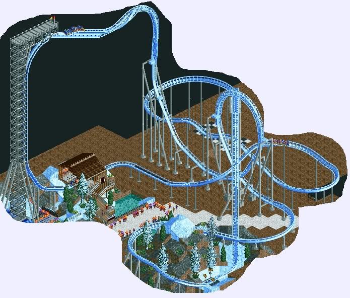
The station is just fine-- that's a great size for one of these, although the roof is new. You usually see these open air. Nonetheless, that's the best version of one of those that I've seen.. I really like what you did with it. Good way to support the main beam as well.
 -

 posix
Offline
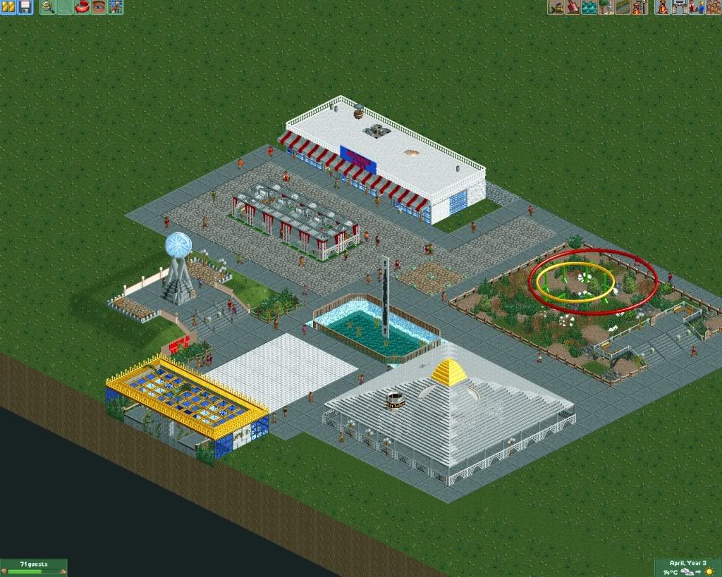
What direction is it you want to go to? And why do you believe rides as theming are the key to ll success? I think that's some wrong ideal you've made yourself believe.I wan't to know if I'm going into the right direction with this.
I lose interest in LL projects very quickly because I always fail to include rides in my theming. Always. Any general tips and thoughts on this? I really want to finish something in LL but it won't happen until I learn how to do this.
I want to learn to use codex too. I need it to finish this screen.
I hate that almost every sentence in this post starts with 'I'. I really do.
edit: And I want to redo the glitchy fountainthing.
You hate every sentence that starts with 'I'? Whew, hopefully now we'll all think as highly of you as you do yourself.
My advice or 'tip' for finishing projects is always the same story: Have vision. Don't build into the blue. Build off ideas.
My definition of idea: A clear picture from the eyes of someone who's in the park you're building. Close your eyes, imagine this sort of picture, build what you see. If you see nothing, jump to a different position in your park and try again.
I personally find it extremly difficult (especially in ll), but also extremly rewarding.
Louis, you're turning into an LL monster these days. Everything I see from you lately makes me go "Whoa!". -

 Louis!
Offline
Louis, you're turning into an LL monster these days. Everything I see from you lately makes me go "Whoa!".
Wow thanks! Didn't expect that. -

 Liampie
Offline
What direction is it you want to go to?
Direction wasn't the right word, sorry. I was curious what New Element would think about the screen and I wanted some general criticism.And why do you believe rides as theming are the key to ll success? I think that's some wrong ideal you've made yourself believe.
That's not exactly what I said! I was referring to actual rides like coaster and flatrides, not trackitecture. My bad.
My LL creations lack a lot of flow... There are rides and there is theming, but they don't blend. Flow and composition have been my main focus in RCT2 for at the last past year, and I'm unable to use these lessons I learned in LL. LL is so much harder than it seems...You hate every sentence that starts with 'I'? Whew, hopefully now we'll all think as highly of you as you do yourself.
?My advice or 'tip' for finishing projects is always the same story: Have vision. Don't build into the blue. Build off ideas.
In the case of this screen there is an idea actually. I admit though, that this map has room for 6-7 areas and I only can think of two I really want to do. LL is more like a sandbox to me; or a stream of consciousness. Maybe that's the reason why I lose interest...
 My definition of idea: A clear picture from the eyes of someone who's in the park you're building. Close your eyes, imagine this sort of picture, build what you see. If you see nothing, jump to a different position in your park and try again.
I personally find it extremly difficult (especially in ll), but also extremly rewarding.
Thanks for the advice!
-

 Six Frags
Offline
Gold.My advice or 'tip' for finishing projects is always the same story: Have vision. Don't build into the blue. Build off ideas.
My definition of idea: A clear picture from the eyes of someone who's in the park you're building. Close your eyes, imagine this sort of picture, build what you see. If you see nothing, jump to a different position in your park and try again.
SF -
 Timothy Cross
Offline
Just be sure to have direction. Even if it's simple. Perfect example= DisneySea by Iceman.
He had vision, but kept a simplified, less detailed (though 'simple' isn't always the necessary way to go) direction and the outcome is a masterpiece.... even if it wasn't the most detailed, it came together as a whole and I consider it one of the greatest parks of all time.
So yeah, I guess what I'm trying to say is have that vision in your mind, but keep in the same frame of mind as the rest of the park. I really think this is key for THE PARK, and not just the building or ride or anything. Keep the overall park in mind and the rest will follow, much easier than expected.Edited by FantastiCo, 03 November 2009 - 02:16 PM.
-

 Lowenaldo
Offline
to be honest, i think its just to big for that space, and it looks a little rough around the edges. it also looks as if you just through the layout together? i do really think your on to something though.
 -

 J K
Offline
I like it. The level of finish your adding to your coaster is really impressive. Isn't the model meant to be quite large?
 -
 Jaguar
Offline
Yeah MA, It is pretty pale and dull, it is only the entrance plaza of a park and the plaza is themed to a 1950's futuristic area.
 -

 Timothy Cross
Offline
I am pretty sure I am unsure. Which makes me think Jag himself is unsure. Because honestly, I am totally unsure.
Poor park-making.
 Tags
Tags
- No Tags
