(Archive) Advertising District / Dump-Place
-
 19-April 07
-

 Louis!
Offline
Milo - Yeah still gonna add details to the roof. Thanks for all the suggestions, especially the height variation, that's something I forgot to take into account.
inVersed - Cheers dude.
MA - yeah I know, it's just in this case I like them.
Shammy - Really? I think this is some of my best work. It may not be the best of what's on the map, but the rest is way to unfinished to show anything. I was just proud of this so I thought I would show a screen. I'm sure you'll like some of the other stuff
nin - Thanks bud. -

 SSSammy
Offline
it just feels like a block with windows. it has no character.
maybe funky it up abit.
space out the windows like others have said, maybe in the middle add some windows made from stations... i have an idea to make a fit ass window
ill show you at some point if it works... it will be perfect here... -

 Hepta
Offline
Liam I really like that screen. The texture is a bit overbearing, but the flow of that building is outstanding.
 -

 RRP
Offline
I really like the glass,your finely creating something that is easy on the eyes
Teaser of some Victorian-themed hotel by some kid. -

 SSSammy
Offline
DH, looking good, but id change the windows to aqua.
dont blurry it up casimir
The storm... it's coming for you! we cant see how pretty it is
_______________________________________________________________
replies to my screen now
thankssammy every screen you post gets better and better
 im glad you think so
i think ive got an eye for the balance nowVery good sam, but keep control of the wall layers. It works here, but it often ends up as unnecessary busy.
 thanks liam.
i never doubted you for a secondsee? looks so much better with black rooves!

more comments would be very much apreiciated
-

 trav
Offline
Aha, I never thought anyone would be glad to see me back to be honest, but yeah, I am back for now
 Looks like I've got quite to bit to catch up on though, eh? Although, I've got a bit of a problem with my RCT which isn't letting me save after I put zero clearences on, even if I've restored them. Any help there would be greatly appreciated.
-

 Dark_Horse
Offline
Shampow, you mean the part thats white change to aqua, or change the inside (which is black right now) to aqua?
 -

 Louis!
Offline
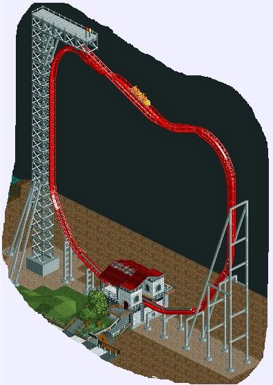
You seem to like doing the small compact style coasters.
This one seems almost too tall. Also maybe give it more of a layout after the Sky Tower? element.Edited by Louis!, 02 November 2009 - 05:03 PM.
 Tags
Tags
- No Tags


