(Archive) Advertising District / Dump-Place
-
 19-April 07
-

 Cena
Offline
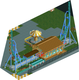
I can't figure out the theme but it looks awesome anyway. I can't wait for this park!

Agreed!
Agreed too!Looks great turtle.Not sure about where the monorail is situated and its supports.
Once again I agree.The colours are brilliant.
That's absolutely amazing
wow
Absolutely yes .
.
That is also what I thought.That's pretty sick...
And that is a big plus in this screen turtle, you haven't overused CS and I hope you don't do that in a later stage (that I mean, don't add CS supports later).i love the fact that there are no custom supports. very nice.
-

 Lowenaldo
Offline
that screen is amazing, idont see a problem with the tree branches though
......im beginning to realize how much i miss this game -

 RRP
Offline
i love the fact that there are no custom supports. very nice.
why would you prefer the in game supports?they're neither accurate or aesthetically pleasing -

 Comet
Offline
why would you prefer the in game supports?they're neither accurate or aesthetically pleasing
In this case they are aesthetically pleasing, as is the case in Turtle's park during H2H -

 Hepta
Offline
^ Very much agreed. I wish you would do something creative with the monorail supports, but the coaster supports look perfect in this screen.
 -

 Fr3ak
Offline
I see it the other way 'round.
Support the coaster and leave the monorail as it is.
Lovely screen though. -

 RRP
Offline
I see it the other way 'round.
Support the coaster and leave the monorail as it is.
Lovely screen though.
agreed but prefereably both -
 CedarPoint6
Offline
The launch track is far too short, but the supports look very nice. Lots of nice little details as well.
 -

 SSSammy
Offline
i think that abit mroe colour in the beige of that wood would help it look less awkward. im not sure i like the station to be honest.
the rest looks great though. -

 K0NG
Offline
I think some of the bracing in the station structure looks a little awkward but overall it's very nice (although there's one support connector misplaced of the left).
 -

 Louis!
Offline
The launch track looks too short, as already said. The station also seems quite boxy, I think it's because it's almost as long as it is wide as well as the roof being quite tall.
The queue, if that is the queue seems a bit short too. -

 trav
Offline
Turtle, everything about that screen just works. The colours are amazing, the landscaping is amazing, just everything.
RRP, I'm not a fan to be honest. I don't know why, it just doesn't seem to have any real atmosphere.
This will never get finished, as with everything else I ever touch

-

 SSSammy
Offline
wow, thats really really nice, that would be a flawless screen if it wasnt for the green roof and the rapids track visible beneath the surface.
everything is very asthetic and well thought out.
 Tags
Tags
- No Tags


