(Archive) Advertising District / Dump-Place
-
 19-April 07
-

 Dark_Horse
Offline
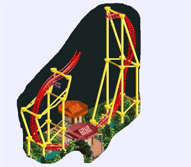
I like the color scheme of the coaster, but the top of that lighthouse needs some work...like a taller/wider roof maybe?
 -

 Luketh
Offline
Yeah, usually lighthouses' rooves are the same size as the actual structure with a light in the center.
 -

 robbie92
Offline

LL Solo. I wanted to try something more simple than what I initially had in LL. This is going to be a seaside Spanish port.
EDIT: Oh, and I've gotten rid of those lamps in-game. -

 zodiac
Offline
very pleasant, but the marble is a bit repetitive. try adding a bit of the brick in the buildings themselves, too.
 -

 MF72
Offline
Perhaps use rapids instead of wooden coaster for the steps?
Looks good, though, Robbie. -

 BelgianGuy
Offline
The stairs exit is on the other side facing away from the rocky cliffs wich is reasonable I think
As for the roof I tried it but then it would look way too bulky -

 SSSammy
Offline
wow, love it
id change the yellow to a slightly darker one though. the supports are perfect. -

 Austin55
Offline
Ok so so I have a n00b question, where exactly can you pull the in game screenshots from? I cant seem to find them
Edit- Thanks X-coaster, I found em'.Edited by Austin55, 26 October 2009 - 07:19 PM.
-
Xcoaster Offline
That's very interesting.
^ Program Files -> Hasbro Interactive (or Infogrames Interactive)) -> RollerCoaster Tycoon (by itself or 2) -

 Austin55
Offline
First screen,
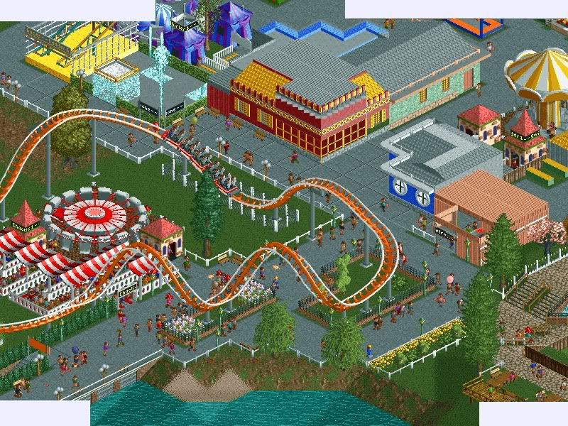
I intend on starting a full topic once a get a little more settled into the froums and people get to know me more, I always hate it when some noob shows up a just starts posting topics everywhere.Edited by Austin55, 26 October 2009 - 07:41 PM.
-

 SSSammy
Offline
the architecture is definately above noob standard.
make yourself a topic, buddy.
sometimes its a good way to help introduce yourself.
welcome to New Element
-
 Timothy Cross
Offline
Yes, welcome... the roofs look a little funky to me, maybe put some more thought into it.
I like that water zone thing though. Even if I like things such as this more as something in the middle of a pathway, it looks cool. Great start.
-

 turbin3
Offline
Looks okay, maybe some more details and bigger buildings.
Try to add more trees/bushes to your foliage.
Nice start.
-

 Luketh
Offline
looks fun, gotta say. Try not to leave your flatrides with almost no scenery. Just plopping one down and saying "DONE" has always been a little annoying to me...
Try using Gee's Winhack Tutorial to make the ride huts invisible, then you can build your own where they used to be.. or, you could just make the hut blend in with scenery all around it.
Welcome to NE, though, I definately like what you have going on, and that archy is WAY above n00b standard, as someone else said.
 Tags
Tags
- No Tags


