(Archive) Advertising District / Dump-Place
-
 19-April 07
-

 Nokia
Offline
^no. the coaster is fine
its LL so what do you expect hardcore deatils?
foliage is also fine.
really only wanted crisism on the buildings
-

 rK_
Offline
^no. the coaster is fine
its LL so what do you expect hardcore deatils?
foliage is also fine.
really only wanted crisism on the buildings
well you should have said that tool.
the coaster sucks.
your archy sucks.
an your foliage sucks.
dont ask for anything in here if you dont want an opinion.
stated.
and yes, LL can have detail, your work just looks random an not pleasing in anyway.Edited by rK_, 20 October 2009 - 07:56 PM.
-

 Nokia
Offline
im not a tool.
the doesn't coaster suck, you wouldn't even know because you haven't even seen the whole thing you fucking troll.
your archy sucks, probably because this is my first time ever showing ll screens, not to mention, really playing the game.
and your foliage sucks, thats just a no.
ahh thankyou. -

 SGT BLOOPER
Offline
^...This guy's an accolade panelist? Love how he dishes out shit on everyone's screens but can't take any himself...lol.
 -

 tracidEdge
Offline
hey nokia ll can totally be detailed. look at bgss. that shit was from like 2 years ago now, and it's still the most detailed ll park i've seen. except for a few h2h parks, that is.
 -

FullMetal Offline
jaguarkid, nice tree! Although I'd recommend using bushes for the uppermost branches, instead of actual trees. Sure, it'll take longer, but it'll look a hell of a lot better in the long run.
As for the first screen, I think the covered queue needs to be a bit closer to the station. As of now it looks like a completely seperate attraction. Actually, I think if you tightened up the whole area, I think it would look fantastic.
And last but not least, lower the water or put up a wall, or you run the risk of flooding out your peeps! -

 Cena
Offline
Yes he did. I saw your bankaccount Grabster. (we moeten ook ff weer is praten op msn, heb je te lang niet gesproken
 )
)
-

 J K
Offline
Hello All,
A little something... again...
-Storm
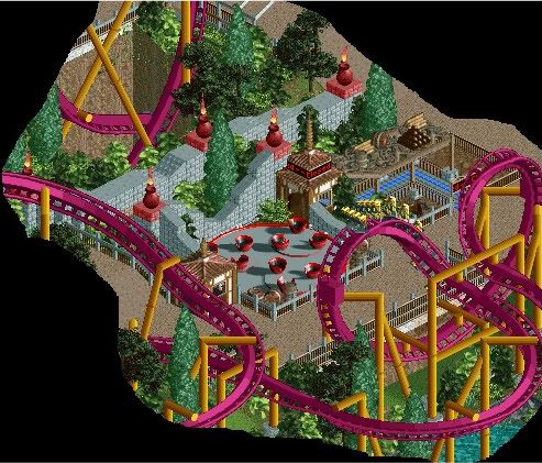
Why are people not commenting on the best screen on the page? SRF that is really nice. Nice fresh atmosphere and as long as you add some more detailing to the path your'll pull it off really well.
Try some 1x4 land blocks on it to make some nice curves along the border as it will suit the overgrown feel I get from your screen.
Also Jag kid nice tree mate! -

 Nokia
Offline
^...This guy's an accolade panelist? Love how he dishes out shit on everyone's screens but can't take any himself...lol.
i was being sarcastic with 90% of my post. -

 Louis!
Offline
Nice stuff Nokia <3 you.
SRF - it's looking good, as said already, the path choice is a bit weird. Also your loop supports seem to be going \ / they need to be / \. -

 Sulakke
Offline
Zoek gewoon echte vrienden, jongen.Yes he did. I saw your bankaccount Grabster. (we moeten ook ff weer is praten op msn, heb je te lang niet gesproken
 )
)
SRF, I dislike the path and I think it will look better when you just use normal paths.
I like the rest in the screen. You've really become better during H2H5.
-

 proest
Offline
W0at Dutch Party op NE, en wij moeten ook even praten Grabster of doen we dat al?
@StormRunnerFan: I don't like the zoo tycoon (?) trees. -

 Lowenaldo
Offline
thoughts on the layout
 [/img]
keep in mind this isnt realistic coaster, ignore the yellow and grey bits. -

 Louis!
Offline
Each layout does pretty much exactly the same thing. Vary it. Make each layout a seperate ride/layout, make it have it's own experience and then bring them together in places.
 Tags
Tags
- No Tags


