(Archive) Advertising District / Dump-Place
-
 19-April 07
-

 Nokia
Offline
looks like shit.
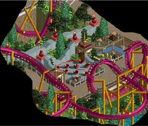
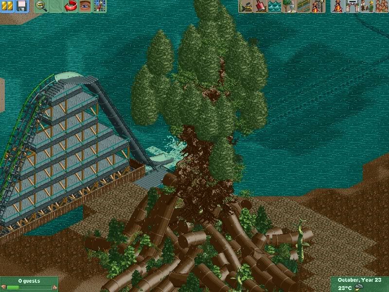
anytime you build a lift hill that big the supports will never look good.
solution: don't make lift hills that big
and you people say i don't post constructive critism, ta! -

 SGT BLOOPER
Offline
^
RMM, on Oct 19 2009, 11:10 PM, said:

Just like your feedback, eh?haha what a comeback. that was pathetic.
I'll wait for more competent builders to comment on the pic, but in the meantime I've got another idea. I don't want to keep spamming this place with giga coaster pics though so I'll just show my solution in the soon-to-arrive topic. -

RMM Offline
seriously?
i did give you feedback. the same shit everybody else said.
it's too high for supports to look good. now a fantasy park? yea it'd be great.
but with a 600 ft giga with the lift the same as the drop? naw, ain't gonna work.
there's your feedback, explained.Edited by RMM, 19 October 2009 - 09:27 PM.
-

 SGT BLOOPER
Offline
^Good man. So my question is finally answered. It would look better with lift hill that isn't as steep as the drop.
 -

 Dark_Horse
Offline
^That's what he said, just backwards, so you're both right. The lift should be more shallow than the drop aka the drop should be steeper than the lift. :-)
 -

RMM Offline
haha yea i know they mean they same thing. but i think he looked at it as making the lift at 25 degrees and not the drop 90. -

 SSSammy
Offline
ahh, quit feeling sorry for yourself, tE commented on them.
hes pretty right though.
not all that adventurous. stick your neck out abit.
whilst its pleasent its very much within that bit everyone can accomplish if you understand me. -

 Luketh
Offline
Try making your exit path farther from the entrance queue, it'd be really easy to hop the fence and get back in line.. plus at first I thought there were two queues, try making one differ from the other visually as well..
 -

 rK_
Offline
Nokia, on Oct 20 2009, 02:40 PM, said:

i love how my screens are just ignored

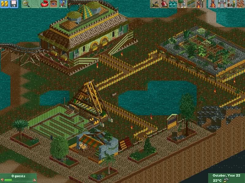
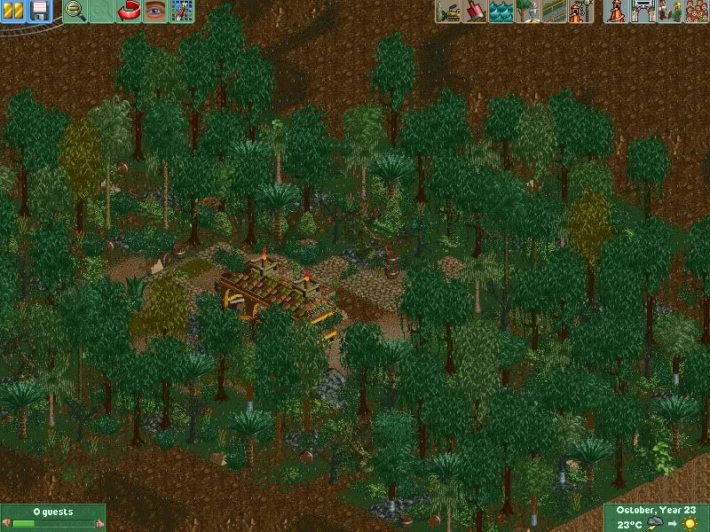
umm, your buildings are odd an random an your foliage is just bad. the coaster looks interesting, i think you should go with a 180 turn into the the cork insted of that 270.
you must rework that station, its just ugly bro, an get away from the 2x2 archy.Edited by rK_, 20 October 2009 - 07:39 PM.
 Tags
Tags
- No Tags


