(Archive) Advertising District / Dump-Place
-
 19-April 07
-

 Cena
Offline
Dragging this one over:

As said, changed the end of the ride. Put in a cork and deleted the straight piece.
It looks worse now, Really, the track after the corkscrew is gonna be a back breaker, And the little upwards section before the blockbrakes too. And the colors, well, my eyes are already broken by them already, so I can't suggest anything about that. -

 Six Frags
Offline
Why do a lot of people here think everyone has the same amount of posts or topics displayed on a page?!?Really good screens on page 260, especially from robbie & nin.

I'm getting so tired of people who behave like that or like drag a screen over to the next page while on my page it's still on the same page (J K does that a lot )
)
SF -

 Comet
Offline
Because most of us have whatever the standard is, and I guess they assume everyone has the standard on I don't know
It's not a big deal though really -

 J K
Offline
I never knew you could change the posts per page. I thought it was permanent.
I'm still going to do it though It makes viewing easier for the people that use the standard set-up.
-

 Six Frags
Offline
yeah, sorry, was exaggerating a bit, it's not that big of a deal..
oh, and rk_, for some reason that screen looks very atmospheric. Good work!
SF -

 Timothy Cross
Offline
Pudding... listen to the advise of the experts...
THIS PAGE NEEDS SOME SCREENS. -

TwistedHelix Offline
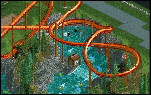
Unfinished in the top corner area and around the Pretzel loop but heres a nice little screen of my rapids ride complete with coaster.
Cheers
TwistedHelix -

 Luketh
Offline
The rapids rides look alot better when you zero clearence the water over them. Looks pretty cool, although that bell seems kinda out of place..
 -

TwistedHelix Offline
Yer I would have zero clearenced it but I'm trying a park without hacks or cs so its the best I can get. The would make sense if I'd showed you the rest fo the area lol (well at least I think it does).
Cheers
TwistedHelix -

TwistedHelix Offline
Why are you sorry FantastiCo lol? Yer I do play rct3 more but this is a pass the time park I have been making for ages when I cant think of anything in rct3. All my rct2 posts in this thread are fit I think.
The pink flowers arnt even meant to be there lol I only noticed after Iuploaded and posted the image. I thought they were the colourable ones from the game as I only checked scenery tabs and not actual scenery items. hmmmm.
Cheers
TwistedHelix -

 BelgianGuy
Offline
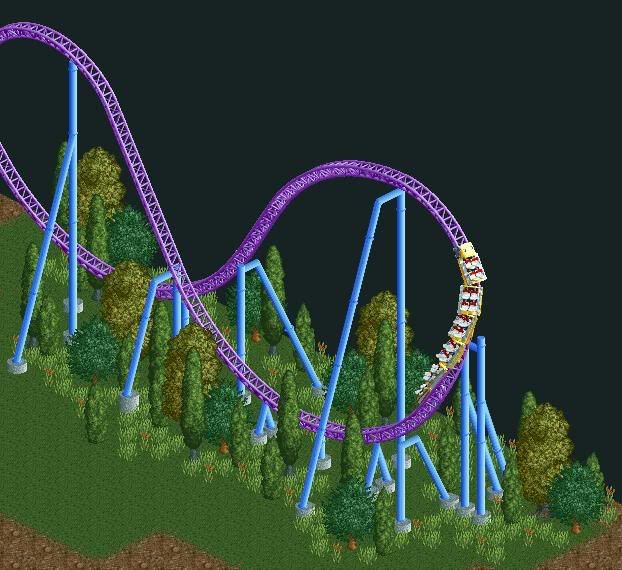
Hows this for a Megacoaster element
Non-inverted Immelman
This was just a hour of fun to kill boredom^^ -

 SSSammy
Offline
i think it would hurt.
pleasant foliage though.
its not an immelmen without the climb and twist
-

 Steve
Offline
It looks like it'd give you a shit ton of air time though. I like it, and I like the colors, too.
 -

 JDP
Offline
^Yeah hence why there has never been one. It can be done, but it would have to probably be a bit more spread out and higher so it has time to maneuver perfectly.
And how about we get a 7th car on that train huh? Be a good idea.
-JDP -

 Cena
Offline
Agreed, but because the game has it limits it does not look good in here (nothing wrong with the idea, it is great) but RCT2 is just limited in the track pieces, this is an example of it. But I really like it^Yeah hence why there has never been one. It can be done, but it would have to probably be a bit more spread out and higher so it has time to maneuver perfectly.
And how about we get a 7th car on that train huh? Be a good idea.
-JDP About the supports, I would change the one that is under the train atm. Maybe like:
|\
| \
|--- \
| \
M M
The M is supposed to be the footer of the support, and that system I typed 2 times, but between them a 90 degrees Angle. (one support at 12 o Clock, and one at 3 o clock, or something like that). That is my idea about it.
There is too many grass (objects) atm I think, maybe refine it a bit ?
?
None the less, I really like it
Edited by Cena, 15 October 2009 - 01:16 PM.
-

 BelgianGuy
Offline
It was just poking a little fun, nothing I really see myself finishing, either way if someone's intrested I can send the file
 Tags
Tags
- No Tags