(Archive) Advertising District / Dump-Place
-
 19-April 07
-

 Dark_Horse
Offline
Holy shit
It's not ugly or bad, it's just...Idk.Edited by Dark_Horse, 08 October 2009 - 11:15 PM.
-

 RCTNW
Offline
Nokia - The supports at that height and force need the angled in support to go with the vertical support. Also, you need to move the path out on that one side so the support footer is in side the fense line vise outside on the path. Other than that, it's not bad but still need work.
Goliath123 - Sorry but not a fan of the supports . I think it's too much even for a California coasters
Faas - Not bad. What is the building for? -

 Bender
Offline
WALL OF WOOD OMG °_°Good, bad or Holy shit thats ugly, What do you think?

Nokia: I really like it, the supports are well done. Nice. -

 Wanted
Offline
I like the layout on Pudding's coaster. Hate the foilage.
I dislike the layout on RRP's coaster. Love the scenery. -

 Wolfman
Offline
It's about two layers of support, too much.Good, bad or Holy shit thats ugly, What do you think?

Imagine having to drill the anchors/footers for each point that the coaster rests upon? That would be insane. That can't possibly be right.
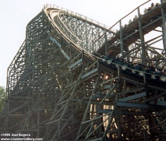
Here, I found a rare image of Cedar Point's Mean Streak. Notice to the left, that the taller support structure doesn't actually slant all the way to the ground? It sort of stops, and then the structure changes to vertical structure.
Here's another example. Notice the supports are mostly virtical. Not spread out.
I hope this helps.

-

 J K
Offline
Nice example Wolfie!
I like the look of them but as Wolfman said they're just a bit too high. -

 Timothy Cross
Offline

What you guys think of this lay-out?
Nobody commented on this, so I brought it over. Layout to me looks... idk, I'm an idiot at coasters. Any comments on Pudding's layout? -

 turbin3
Offline

Chances are really high, that this gets finished.
I've holidays now, so much time to build on it.
Comments are welcome. -

 SSSammy
Offline
never thought id hear myself saying this
deco piece overload, buddy
especially on the green building, id try to tone that down a little, not everything neets outlining in sharpie. -

 Wolfman
Offline
Wow! nice tiny structures. I could
Chances are really high, that this gets finished.
I've holidays now, so much time to build on it.
Comments are welcome.steallearn something from this guy. -

 Luketh
Offline
Pudding, that layout is fine, reminds me of Superman Ultimate Flight @ SFOG.
Love that screen, Turbin3, but as Sammy said.. Deco piece overload. -

 CedarPoint6
Online
^ Are you sure your thinking of SFOG's Superman... considering that it's not even remotely similar...? Except for maybe color.
It's not a bad layout, although perhaps a little short. The flow is more or less there, although I don't like seeing curves out of zero g rolls. I think they need straight entry and straight exit. Other then that, it's a pretty good layout although you may want to find a way to avoid that flat section before the final helix. That could make it a lot stronger.
 Tags
Tags
- No Tags


