(Archive) Advertising District / Dump-Place
-
 19-April 07
-

 RRP
Offline
I am using RCTM but the black holes are under the entrances and exits (that have been removed via gee's 8cars method) of the coasterCorrect me if I'm wrong... but I don't think those are wormholes. I think that's just what RCT Modified does as it removes the entry & exits and the ride base.
Which really doesn't look any better IMO. Especially when the attraction is raised a bit.
Wormholes don't always show up in the same place on various attrations. Like always under the entry and exits. -

 robbie92
Offline
That is by far the best El Loco I've seen attempted in RCT. It looks beautiful.
As far as the bases go, go to map car manipulation on 8cars, click remove, then click "null items." With these removed, you should get your huts visible again so you cna repeat the hack again. -

 J K
Offline
Probably the best coaster I've seen in a while. I automatically thought of Mumbo Jumbo at Flamingo Land. Really good execution. The other stuff around the ride is ok but that coaster is awesome.
 -

 SSSammy
Offline
RRp, i opened the game up, and they are black holes.
i think i had this problem when i accidentally saved over one of my files, and i see from the file name in the FGs that you have only advanced two files, my automatic assumption is to think that you have saved over a few times whilst working, but maybe you have only worked on it twice.
if the former is the issue, i urge you to save new file, if it isnt, please save more frequently so you can go back to before the problem started
god i sound like cena now. not what i wanted haha. -

 misterthom
Offline
i really like the coaster and the twisters placement.. But i am curious what you're going to do with the old timers. since they dont have much space in there.
misterthom
Offline
i really like the coaster and the twisters placement.. But i am curious what you're going to do with the old timers. since they dont have much space in there.Edited by misterthom, 05 October 2009 - 09:30 AM.
-

 gir
Offline
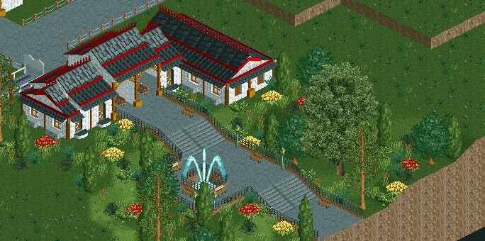
I like the building but dislike the fountain (it spills onto the path) and foliage (too random and sparse).
 -

 Dark_Horse
Offline
I'm with gir about the fountain, but I also dislike the building as an entrance. It's a nice building, but doesn't seem like an entrance to me.
 -

 Dark_Horse
Offline

I know it's unfinished, but I feel like something is missing (could just be foliage though), but I'm open to suggestions. It's going to be a monorail station for a certain hotel I'm building. I'm not releasing any details of this project, just yet, but a certain website has given me a lot of inspiration and ideas. -

 nin
Offline
add details inside the station. for structures such as this, i tend to build from the inside out, including everything that goes into a station and work my way from that.
 -

 Luketh
Offline
Yeah, that's like.. a blocky shell.. needs foliage (yes, I know it's unfinished) and the little details nin talked about.. maybe you could bump a bit out some to make it seem less like a large block..?
 -

 pascal
Offline
The monorail is missing.
...
Perhaps a new texture at the base of the structure? And stairs going up to it.(unless they are on the other side) -

 tracidEdge
Offline
i'm really surprised that you think that it's missing something, dark horse. i don't see how anything could be any more complete than a white box with a red gable roof. i like my building shapes strictly geometrical with no detail or thought put into it at all.
 -

 Dark_Horse
Offline
I'm trying to get help in making more detailed and you go on about your sarcasm. How about you do me a favor and either don't post shit that won't help me, or point out something that I could improve on. I know it's unfinished, but that's no reason to be smartass about it.
 -

 tracidEdge
Offline
here's some help, put some detail on it. a giant white box is boring. i don't understand how that doesn't help you, aside from me not holding your hand telling you exactly what to do.
 Tags
Tags
- No Tags


![][ntamin22%s's Photo](https://www.nedesigns.com/uploads/profile/photo-thumb-221.png?_r=1520300638)

