(Archive) Advertising District / Dump-Place
-
 19-April 07
-

 Lowenaldo
Offline
i like the empty grass space. its simple. not every inch of a park has to be covered with shit.
 -
 Luketh
Offline
Awesome, I'm getting comments on my shit now.
Okay, just to let everyone know: The waterline at the edge of the screen is going to have some cattails, flowers and other nice pretty waterside flora on it. The ride is supposed to be a flattened grass field with only that ride and station on it that's gonna be fenced in by a chain-link fence. I think you grass haters will like it more when you see it in-game, or bigger screens.
But yeah, thanks a fucking LOT for posting all this guys, I'll take everything into consideration.
Edited by Luketh, 30 September 2009 - 06:37 PM.
-

 ACEfanatic02
Offline
A few points, Luketh:
- Track placed directly on the ground generally looks bad. That long stretch coming out of the station there, for example.
- The problem isn't that there's a lot of grass under the coaster. The problem is that there isn't much coaster. Either the station's placed oddly in the layout, or the layout itself isn't tightly built. Look at real coasters, and they always try to fit as much track in as small an area as they can.
- Also, try another color for the flat portions of the roof. The peeps can't see it, so why would the park bother color-coordinating it with the rest of the roof? Black or grey would work better (flat roofs are typically bare tarpaper or gravel-covered).
-ACE -
 panther33
Offline
I got rid off Scream/Medusa and created a whole new coaster..... Chang! I honor of Chang at Kentucky Kingdom. This coaster is much better than the originals!
This screen is obviously unfinished..
Comments, questions, and criticism is apriciated!
-Chris- -

 K0NG
Offline
I know that's way, WAY unfinished but....you seem to already have about six different fences/walls going on there. Might want to get more of a flow going and decide what's going to work for the area and get rid of a few.
Also....I actually have something in the works that I REALLY like. It's the purple floorless that I showed in my last screen. Don't have anything finished enough to post a screen of ATM but, if I can keep the flow that I have right now and not get bored with it.....My only thing is....I'm debating whether to focus on the one coaster (with a rapids that interacts) and maybe do a 'design' type of thing or, to use the whole map and do a park. With my history of not finishing a whole lot of projects, I want some advice on what to do. FINISH a 'design' size map or shoot for the big picture and expand to the whole map (it's 120x120).
Any suggestions? -

 misterthom
Offline
maybe you can focus on it being a design, and when its finished and you still want to build on it. Then perhaps you can expand it.
 -

 nin
Offline
K0NG, go ahead and make a design out of it. Let's say thst afterward you finish everything on it, but still feel like doing more and then turn it into a park..?
and panther, that's just a bit too unfinished for comments. -
 Jaguar
Offline
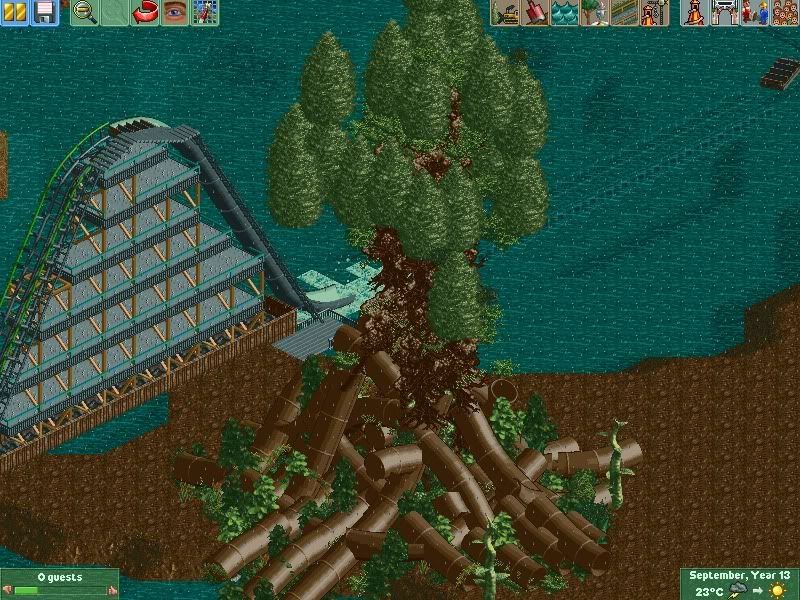
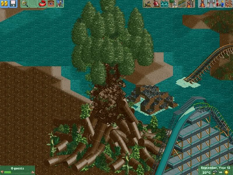
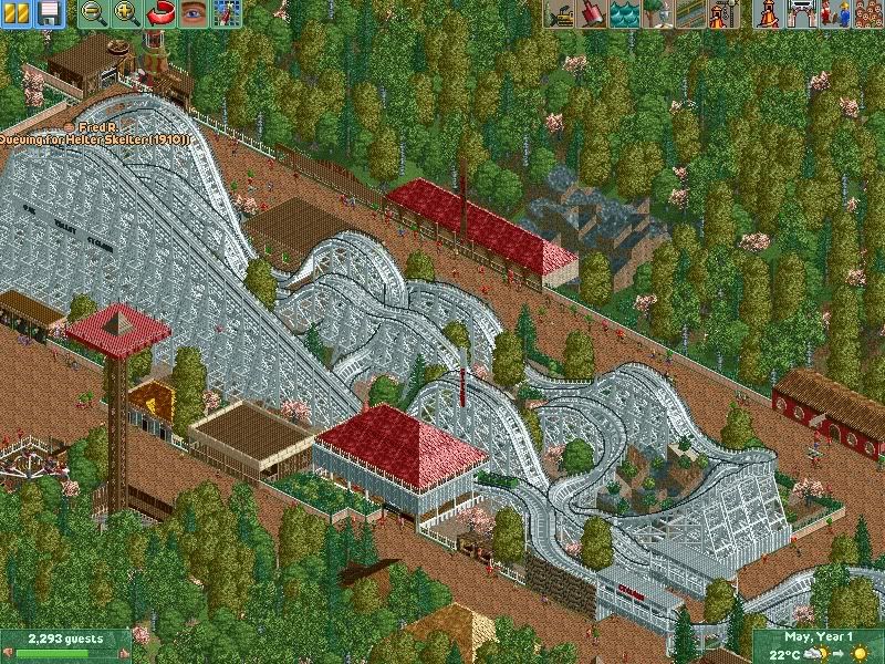
Just some old screens of a park I finished a while ago and submitted it to NE about a month ago. The style is classic (so is the time period). -

 Dark_Horse
Offline
I wanna ride that woodie in screen 2. Ah, crap I set myself up for a joke, oh well.
 -

FullMetal Offline
 Dark_Horse likes to ride woodies! Don't feel bad, I like a good woodie too.
@jaguarkid: I think you need a few more buildings in there. Or maybe some carnival games, or something. It looks like the peeps might get bored going from one attraction to another. But at least you cut back on the jagged rocks. You deserve a lot more credit than you're getting. It's hard to quit when you're addicted. -

 K0NG
Offline
 Dark_Horse likes to ride woodies!
Yeah, tell us something that we don't know.
And Jag.....what FM said. Plus, those Magnolias just bug me for some reason. -

inVersed Offline
Jag, that's easily some of your best work. Even the jagged rocks looks kind of tasteful in screen 3. -

 SSSammy
Offline
i cant say i enjoyed that park.
i didnt think the jagged rocks were tasteful like InV did.
although i dint think it was you, either. it was a huge improvement from your other work.
 Tags
Tags
- No Tags


![][ntamin22%s's Photo](https://www.nedesigns.com/uploads/profile/photo-thumb-221.png?_r=1520300638)