(Archive) Advertising District / Dump-Place
-
 19-April 07
-

 Cena
Offline
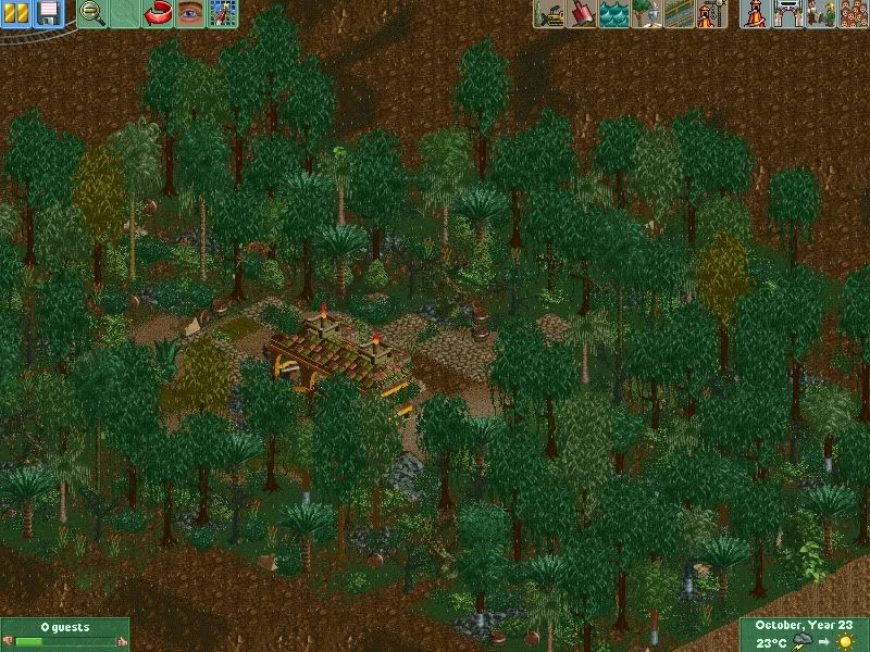
I got it to build a house i don't hate


Ignore the missing fence please, i don't know what happend there.
Are you a little brother or sister from Turbin3? You 2 have exact the same style.
Edit:
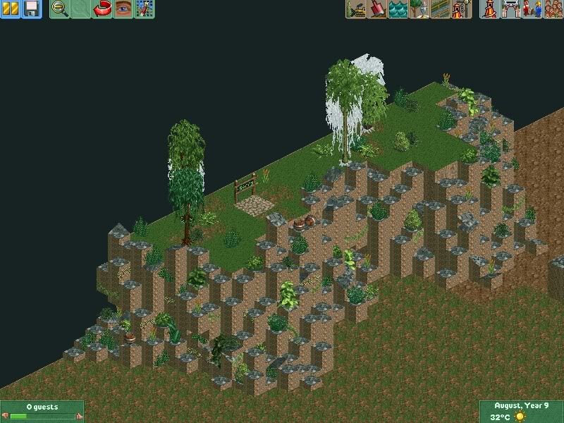
OMG, RRP, that looks fucking AWESOME. Really cool.Edited by Cena, 29 September 2009 - 09:45 AM.
-

 SSSammy
Offline
i spot mega mechano structure.
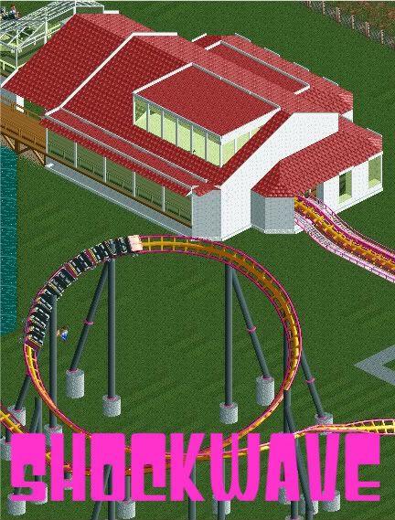
ill give all you guys 5 guesses as to what the beige building with the parking lot is. its one of my favourite things ive ever seen in RCT. noone from FG can ruin it ahah
PS thanks Yall for the comments on my screen
-

 Steve
Offline
I agree, but I still think it needs more.Love the fact that you put in jagged rocks, just for good measure.
-

 Hepta
Offline
i think the jagged rocks look good. the entrance doesn't flow though. and although this is the dump place, finished screens are always much easier to comment on.
 -

 ACEfanatic02
Offline
Hey, give him credit, this is the first time he's done it *right*.Love the fact that you put in jagged rocks, just for good measure.
Also, RRP: I came. Good god that park looks awesome.
-ACE -

 6000000flags
Offline
Your design so far looks good, but you need to fill up that empty void right there. Might I suggest some terrain or foliage?
 -

 RamSam12
Offline
Really? I don't get what people here have against coasters placed on grass fields and feel every tile has to be filled with detail. I understand how there are often bushes around large structures such as stations, but shit - sometimes if people are going for a realistic style park, they are emulating quite a few parks have coasters with only a grass field underneath. Look at Worlds of Fun how their Mamba and Patriot coasters are pretty much built over large grass fields. My current project, which has a Worlds of Fun midwest style to it, does and I'm sure as hell not going to fill it in when the intention is a park built up on a simple landscape.Your design so far looks good, but you need to fill up that empty void right there. Might I suggest some terrain or foliage?
-

 SSSammy
Offline
thast one thing, but in this case, lack of detail and terrain makes it look boring and immature.
 -

 MF72
Offline
I'm not sure immature is the correct word SSSammyboy. But I do agree that it does look rather empty and uninviting. I think a small clump of foliage would do nicely and some small hills.
 Tags
Tags
- No Tags


