(Archive) Advertising District / Dump-Place
-
 19-April 07
-

 Dark_Horse
Offline
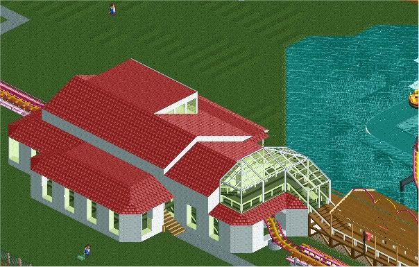
The triangles on that building detract from that screen Sammy. Otherwise, that thing is beautiful, you've improved a ton since I last saw your work. It's amazing how people get better over 2 months.
 -

TwistedHelix Offline
I'm also going witht he triangle windowed consevatory type thing. I think its because the windows coem to a point. If I was you I would blunt it and have it look like a trapeze rather than a triangle and that would solve it I think.
Other than that its a really nice building.
Cheers
TwistedHelix -

 Wolfman
Offline
The shingle roof that has a valley, instead of running straight into the side of the second level seems odd.
The doorway on the side, breaks up the trim.
The strange roofs that come to a point over the windows.
The mixed roof materials.
The overhang instead of the trim along the top floor, below the attic window. It seems the brick detail should be there instead.
The trim above the brick detail looks out of place. Too much detail banded around the structure. I'd remove it because it's freestanding at the corners. There's really no room for it actually. (You can see it in white at the back corner above the second level on the backside of the house.)
The fence along the expanded balcony might look better in white or beige, than black.
The fence surrounding the gardens might look better if it ran up to the corners of the house.
Place a few base blocks inside the windows, so the floor doesn't look like it's incomplete.
Some flowers on the balcony, and a few taller trees on the back tile strip would distract from the stark black of the background.
Scatter a few lamp posts and benches around the area. So it doesn't look like it's totally void of life. -

 Dark_Horse
Offline
Haha, RMM just owned Wolfman. I agree with RMM, though. Let Sammy figure out how to fix his building based on people's opinions on what looks wrong. Telling him what to do to fix it (as RMM said) makes it "your" park. I have no idea what that is Stanman, but it looks cool.
 -

 JDP
Offline
Fail.OOOHHH! Grandpa & Grandpa Land!
Does it have a Social Security Check in the mailbox?

Please ban him
-JDP -

 SSSammy
Offline
afew moar maybe mr horse? : D
i tried different rooves but it came out looking so ridiculous.
maybe its even more ridicoulous now to a more rational mind
so, any better? -

 Dark_Horse
Offline
I like the arch on the left side...the one over the garage (I'm guessing that's what that is supposed to be). Not sure about the shake/tile/shingle roof combo though.
 -

 Luketh
Offline
I! don't really the shake/tile/shingle-ness...
Although you could try taking out the shakes and just making it tile.. or whatever the topmost one is, shake or tile... -

 MF72
Offline
Not I. Sure he may have been a little annoying, that doesn't mean he should be banned.
About the screen: I think what bothers me the most about it is how those grey bricks under the roof stick out sometimes. Might I suggest continuing them all the way around instead of just on corners and under the arch. -

 Luketh
Offline
Shockwave!
The rain's made the water raise way up, and that's one pissed off lawn mower right there.
 Tags
Tags
- No Tags


