(Archive) Advertising District / Dump-Place
-
 19-April 07
-

 Splitvision
Offline
That's pretty FM, but I'd change the colour of the signs or their text because it's a bit hard to read it as it is now. I like the planters (that's the word for those things in which the flowers/plants are right?), but I think you should skip the jungle plants (since I guess this is not in a tropical setting). Anywayz good job!
Splitvision
Offline
That's pretty FM, but I'd change the colour of the signs or their text because it's a bit hard to read it as it is now. I like the planters (that's the word for those things in which the flowers/plants are right?), but I think you should skip the jungle plants (since I guess this is not in a tropical setting). Anywayz good job!Edited by Splitvision, 21 September 2009 - 04:16 AM.
-
 Timothy Cross
Offline
Lowenaldo! Awesome man! I should try something like that... or have I already been doing it for years minus the coaster and plus some kind of theming or acrhitectural interaction displaying the entire park as a full working concept without a hint of randomness and all tried together with some kind of idea noone has ever tried and speaks a message about the very end of an age into the next stage of spiritial evolution.
Nah, I just been cracking jokes... looks great though, like actual landscapes instead of a bunch of jagged rocks just showing peaks and whatnot. Keep it up, I think your on to something... -

 Lowenaldo
Offline
actually fantastico ive viewed your landscapes alot and try to emulate them. i find your landscapes to be incredible. in fact thats what i wanted to base this design around more so then the coaster, the surroundings.
Lowenaldo
Offline
actually fantastico ive viewed your landscapes alot and try to emulate them. i find your landscapes to be incredible. in fact thats what i wanted to base this design around more so then the coaster, the surroundings.Edited by Lowenaldo, 21 September 2009 - 03:31 PM.
-

 K0NG
Offline
Here's the screen that was missing from my previous post. Funny thing (to me anyway) was that I previewed my post, saw that I had forgotten to load the screen, was a little bit high and just went with it.
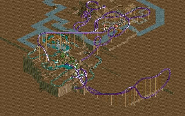
Floorless coaster with accompanying rapids.
Don't mind the paths....they're just there right now to get peeps onto the rides. Except the one that goes under the lift...it's part of the plan.
In it's infancy but...I like how it's going. -

 posix
Offline
what, a screen by k0ng?
looks nice, although i disagree with the mountain interaction. -

FullMetal Offline
@Video_kid: Thanks!
@Splitvision: Their supposed to be of the southwest variety. I'd use cacti, but I don't have any in the bench. And I changed the sign to a darker color.
@Dark_Horse: Yeah, I like the name too. Much better than the Blood and Guts Cafe from DRC. -

 SSSammy
Offline
K0NG that is damn fine brutha. i sincerel look forward to seeing more.
anyhoo, a big screen and a little screen here:
i think you guys will like this more in-game, cause i do. haha.
theres no icecream on gees bench
so its a soda stall.
haha
theres something about this building that i dont like...
im hoping someone can point it out for me, cause i cant seem to put my finger on it.
fankyou -

 Cena
Offline
Both are good, but the first is too much, get rid of the angled things on top of the awnings and put flags under it if you like, I think it would look better like that, your choice.
Second: I think it is the glass on the triangle. Every windows fits the building except that in my eyes, too modern compared to the rest. Just my idea.
Good luck Sammy
-

 J K
Offline
The clear windows at the front instead of using the peak of glass flatten it off at the front so you have three sides to the glass window.
Also the texture of the highest roof is lovely. Mixed with the other two below that is wierd imo. Take the texture off the lower version and change it to one of the other two.
Nice soda stall. -

 Comet
Offline
Sammy I'm just wondering why the stall is on the grass, it looks nice but weird spot for it
Pudding I think you should use a different brick there and maybe a different fence around the water too -

 Six Frags
Offline
Those ugly cjk roofs ruin your whole building..
theres something about this building that i dont like...
im hoping someone can point it out for me, cause i cant seem to put my finger on it.
Other than that, the screens look nice
Oh, and pudding, that's a bit generic, maybe add some more theming to it? There seems to be some flow though, so good job on that..
SF -

 SSSammy
Offline
thankyou YannikThat buidling is so amazing, really, I just love it!

thanks for the comment cena. i based it on some of the architecture around where my grandma lives, which happens to be one of the most beautiful places on the planet, and there are tonnes of windows like that. plus it looked much worse before i added it in haha.Both are good, but the first is too much, get rid of the angled things on top of the awnings and put flags under it if you like, I think it would look better like that, your choice.
Second: I think it is the glass on the triangle. Every windows fits the building except that in my eyes, too modern compared to the rest. Just my idea.
Good luck Sammy
ahh, ill try those things. thanks mr just kidding.The clear windows at the front instead of using the peak of glass flatten it off at the front so you have three sides to the glass window.
Also the texture of the highest roof is lovely. Mixed with the other two below that is wierd imo. Take the texture off the lower version and change it to one of the other two.
Nice soda stall.
ithankayou JDP.Sammy that building is wonderful.
-JDP
have you never seen on a beautiful sunny day, people sitting on the grass just talking, and a salesman, spotting a hotspot, scuttles over to make some munneh?Sammy I'm just wondering why the stall is on the grass, it looks nice but weird spot for it
Pudding I think you should use a different brick there and maybe a different fence around the water too
haha, thanks for the comment. -

 Cena
Offline
Those ugly cjk roofs ruin your whole building..
Other than that, the screens look nice
Oh, and pudding, that's a bit generic, maybe add some more theming to it? There seems to be some flow though, so good job on that..
SF
Nothing against you, but your opinion about those cjk roofs only applies to you, Maybe some others think different I hate them to, but in this situation (brown/white) it works really well I think
Pudding, I know you from RCT-Guide, and although I don't like you as much as others when it comes to RCT, that is pretty good, and you are improving, yes improving, it goes slowly, but you are, really, good job on that . I think my main tip for you is searching for inspiration / images & pictures that give you more detailed information about real buildings, then if you try to recreate those, and take your time for it, you get better with every building. I did it too and it worked
  .
.
Good job and good luck Pudding. -

 Cocoa
Offline
its the extension to the side, sssammy. the grey bricks stick out and the roof is really ugly. otherwise, amazing building.
 Tags
Tags
- No Tags
