(Archive) Advertising District / Dump-Place
-
 19-April 07
-

 SSSammy
Offline
thankyou robbieSSSammy: The bottom brickwork looks a little busy to me, but the upper level looks really nice. The seating area out back is great as well, especially those planters.

haha, thanks. sos your workOHMY GOD.
epic AND stunning?
sammy, your work is JESUS.
:]
no really bro, it looks fantastic.
thanks yannik, means alot to hear these complimentsLooks amazing, Sammy, great architecture.

yesss you get gareths seal of aprovallooks good sssammy, i like the wasp trap. i always like those details(its on one of the planters?)

they are empty apple juice bottles, they smell ugary to the wasps and they fall in and get stuck
thanks for all the comments, i love hearing them, and i love critisism aswell, it is far more usefull than a compliment
-

 Comet
Offline
I really think those things you used for fences are meant more for building detail, maybe try something else
Dark Horse I really like that layout, you made a boring coaster type pretty interesting -

 Xophe
Offline
That's an impressive screen Alpengeist! Well done making those custom plants look good. The architecture is good on the station but it lacks texture - maybe you could use regular roof blocks instead of the building blocks you've got right now...? I like the colours too. Pretty bold choices but they seem to work here.
 -

 Alpengeistfan1
Offline
Thanks. No one's every given me that emoticon before. foilage isnt the best though.
Thank you. I've never really used much of the landscaping pack before, but I think it turned out ok.On the contrary, I find it to be the strongest point in the screenshot. The objects aren't the best I think they work extremely well here.
Thanks for the suggestion but I'm going to stick with that fence. I tried out a bunch of different kinds and I think that one works the best.I really think those things you used for fences are meant more for building detail, maybe try something else
Thanks about the colors. I wanted to make an American themed coaster and I tried using the brighter red but it didn't really look right. I would use the regular roof blocks but I don't have them selected.That's an impressive screen Alpengeist! Well done making those custom plants look good. The architecture is good on the station but it lacks texture - maybe you could use regular roof blocks instead of the building blocks you've got right now...? I like the colours too. Pretty bold choices but they seem to work here.
-

 Lowenaldo
Offline
 [/img]
its a ncs park, electric fields i think?, but i plan to put up a download soon it will be my first release here.
(not going for a accolade, this is just for fun) -

 Maverix
Offline
From that park I showed earlier...
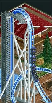
Anybody care to guess the theme?
And Lowenaldo: For NCS, it's not that bad, seems a bit barren though.Edited by Maverix, 12 September 2009 - 06:21 PM.
-

 nin
Offline
This stand up was to be built in the 90's craze, where so many were produced yet there really was no major difference between them.actually nin, i didn't even realize it but you completely stole about 80% of Mantis.
-

FullMetal Offline
Shammy, your screen was the sex. Very impressive.
Alpengeist, holy crap! Those colors work great together. And like Steve said, the foliage works really well there.
Lowenaldo, my Electric Fields is better than your Electric Fields!
Maverix, the supports look great, but the ladder looks kind of awkward. -

 Luketh
Offline
^ I agree with FM about the ladder, too straight up and down. Looks like a little, detailed land block.
I has a question for everyone (again). Then I have a screen-o.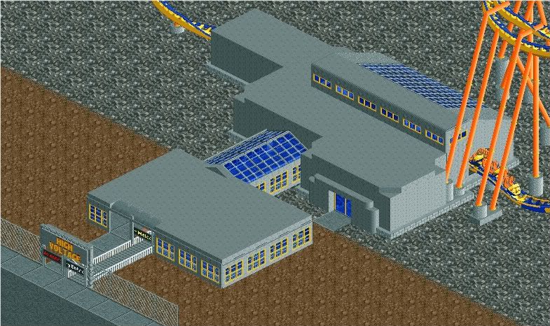
Is there too much gray here? The station IS unfinished, I dunno if that'll be the final. This is supposed to be a electric-ey themed ride which takes out of a factory station. Is it working.. kinda? No? Yes? Thanks for your replies.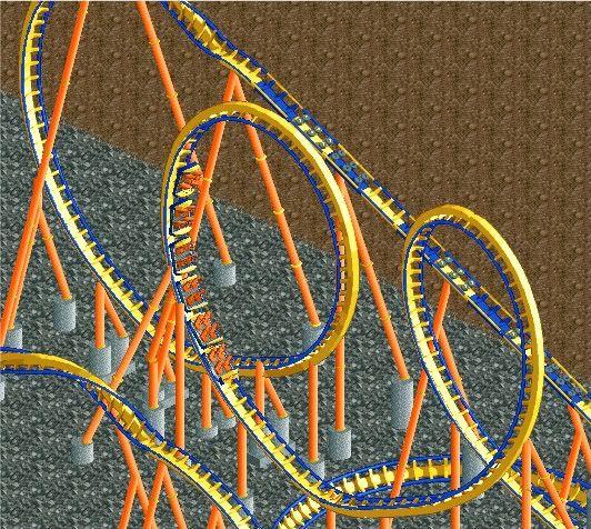
I started messing around with supporting, which is why I made this coaster. This is my first attempt at supporting a coaster with more than like 2 overpasses, these loops were freaking hard to support, but I think I did a good job.
-

 Alpengeistfan1
Offline
From that park I showed earlier...

Anybody care to guess the theme?
And Lowenaldo: For NCS, it's not that bad, seems a bit barren though.
Ice? Celsius?
-

 Maverix
Offline
^Sort of, but not quite. And no, it's not named Celsius.
And thanks to everybody else who gave comments. And about the ladder, the reason I didn't do a spiral staircase is because it would look awkward, so then I tried the ladder, and I tried for the realism of those cages around them for safty. I'll try to work on something though, any suggestions?Edited by Maverix, 12 September 2009 - 09:10 PM.
-

 Lowenaldo
Offline
 [/img]
well i ment to put this one in with the other one too, well here it is anyways.
fullmetal, this towns only big enough for ONE Electric Fields...... so i changed mine to Electric Gardens
also luketh, yeah two much gray, go ahead and throw in some colors and it should be good, but i dont like how big those gray footers are though......Edited by Lowenaldo, 12 September 2009 - 09:14 PM.
-

FullMetal Offline
@Lowenaldo: Well, technically mine is Electric Fields Amusement Park, so calling yours Electic Fields wouldn't cause too much trouble. It does look good, though! -

FullMetal Offline
The addition to Le Tonnerre is moving along smoothly. Too smoothly, actually. It will probably be released within the next week, far sooner than expected.
Anyway, here's one of the new attractions: Le Parapluie de Roi. Between Le Tonnerre, Rafale, and Déluge, there isn't much that's kid friendly. And with the other half of the addition, something mild was needed to offset the high thrill.
Enjoy!
 Tags
Tags
- No Tags


