(Archive) Advertising District / Dump-Place
-
 19-April 07
-

RMM Offline
rctca, nice that you are expanding but it's just too much.
too strong, the track and all that. add some actual building up in the middle there maybe.
i think it'll look better if it was broken up a bit. -

 gir
Offline
Sorry robbie, but for me it doesn't really work. Am I missing something? I am with Laimpie in thinking it is rather uninteresting. I think it's because it lacks any sort of liveliness.
 -

 robbie92
Offline
^To be honest, if I was looking at it as an outsider with little knowledge of the park, I would tend to agree. Coming to LL as an RCT2 player though means that I'm forced to deal with more limited options, as well as a very basic knowledge of LL hacking, mainly codex. If this were an RCT2 park, you'd find the archy and colors more like what I've done for the woodsy area in Muskoka Grove. However, since there's little I can really work with, it's a little monochromatic.
I guess what I'm trying to get at is that I'm not going out to emulate any certain style in LL other than my own in RCT2, so this park is going to have a different feeling than most other LL parks, as far as the buildings go. All I can say is that I miss my wall pieces.
-

 spartan
Offline
robbie: one of the reasons I love LL is you have to be creative. You gotta be more imaginative, use items for other purposes, experiment with paths and tracks to add new textures and colors, ect. I'm already liking it, just add that something special and you're good to go.
Nin: agree with ACE
RCTCA: I really like that building but the chaos of the path ruins it. I think if you got rid of those flowers and have a wide path I could concentrate on the building without my eyes being drawn down and going WTF? -
![][ntamin22%s's Photo](https://www.nedesigns.com/uploads/profile/photo-thumb-221.png?_r=1520300638)
 ][ntamin22
Offline
robbie92, on Sep 8 2009, 09:06 PM, said:

I guess what I'm trying to get at is that I'm not going out to emulate any certain style in LL other than my own in RCT2, so this park is going to have a different feeling than most other LL parks, as far as the buildings go. All I can say is that I miss my wall pieces.

two things- firstly, LL isn't RCT2. Trying to emulate one in the other will usually end up looking less awesome than if you cater to the needs and aesthetics of the game you're using.
secondly- you know that with codex you can basically use fences as wall pieces, ya?
here, lemme PM you something. -

 panther33
Offline
Everybody SCREAM!
Still unfinished..
Comments and criticism are what Im looking for!
-Chris- -

 CedarPoint6
Offline
^ http://rcdb.com/2169.htm?p=10695
Looks good, although I recommend the parking lot continue it's pattern despite the fence. -

 RCTNW
Offline
Nice to se one of my top 5 coasters bing built! Looks good so far and I agree with CP6's comment about the parking lot
 -

 Louis!
Offline
Yeah looks good, I like how the fenced off portion is a worn out colour.
Is this an exact recreation? -

 posix
Offline
i mean, you'd at least have to put some fences where the track is so they don't park there, right? looks nice though.
 -

 Luketh
Offline
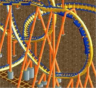
Unfinished, just asking a question here... Is the color combo/supporting any good? Thanks. -

RMM Offline
looks great. the colors do too.
i think the supports could be worked out a little better though.
seems to be too many here and there. -
 Gwazi
Offline
yeah these colors looks stupid but they really work here. i dunno how you did it, good job.
 -

 Dark_Horse
Offline
Sorry Luketh, but the colors don't work for me. Also, way too much supportwork. Take it or leave it.
 Tags
Tags
- No Tags
