(Archive) Advertising District / Dump-Place
-
 19-April 07
-

 posix
Offline
what i find so interesting about them is how they were used first by disneylhand in his pt3 entry but nobody seemed to care for them. i'd love to know from xophe if they were his own idea or if he used them because of disneylhand.
i think it's safe to say though that they have become immensely popular because of zippo and not busch gardens north america. so something xophe did with them must have been different and much more appealing to people. -

 Comet
Offline
^Xophe proved that he showed a screen of them before dlh's park was released, so I'm pretty sure there his idea.
I think that might have been in the Zippo's thread but I'm not sure.
Edit- nevermind I couldn't find it there, I just remember him mentioning it somewhereEdited by Comet, 03 September 2009 - 10:26 AM.
-

 Cena
Offline
It was in his post of 19 June 2008, but it was on Imageshack.us, so it is deleted after a while.
 -

 SSSammy
Offline
Liampie, Cena, you might have your reasons for your feud, but im sure im not the only one quickly tiring of it. take the grudge elsewhere gents, play nice.
i was using one i made during H2H, when i got \all these new funky items, but i never used it before now. thansk for teh commentIt's nice. The balcony seems a bit texture-less and the building I think would look better as a 4x2 into a 5x3 rather than a 5x2.
But as it's not being used it doesnt matter. What bench are you using one you made yourself? It looks like the Vampyre bench, that's a damn good bench.
i havnt got the hang of colour yet, so maybe you could tell mewheres the colour?

SSSammy: Looks great! You've improved really quickly!
thanks, that means alot coming from you, robbie! -

 turbin3
Offline
Looks great, don't like the jungle-plants that much though.
The brown umbrella needs some colour.
Yannik -

 Louis!
Offline
yeh that's nice work. DFS? I'm guessing it's some sort of Disney Hotel.
I think the trackitecture flower beds open up a whole new range of ideas not just for use as flower beds (you'll see when I showcase my park).
If someone did them before Xophe it doesn't matter, it's the fact that Xophe done it in a certain way that made people realise it's such a good idea. -

 LiveForTheLaunch
Offline
Kay I HATE when people say things always have to have colour. If you look at buildings, not all of them are bright and rainbow-esque, haha. I think it looks just fine
-

 Goliath123
Offline
what i find so interesting about them is how they were used first by disneylhand in his pt3 entry but nobody seemed to care for them. i'd love to know from xophe if they were his own idea or if he used them because of disneylhand.
i think it's safe to say though that they have become immensely popular because of zippo and not busch gardens north america. so something xophe did with them must have been different and much more appealing to people.
I said that a day after it came out, i proved it in the little things thread on page 10 -

 Lowenaldo
Offline
ok, i cant for the life of me figure out which colors i want to use, so i was hoping to get some input from you guys. any suggestions would be nice.
 [/img]
 [/img]
 [/img]
Edited by Lowenaldo, 03 September 2009 - 03:41 PM.
-

 CedarPoint6
Offline
^^
You mean except for the part where he told you his was before?
http://forums.nedesi...w...3566&st=270
And you should probably decide on colors depending on what theme you're going to use. Either looks alright. Keep in mind that supports won't have different colored flanges, though. -

 Comet
Offline
Grand Floridian, Cena?
I love that style of architecture so I really hope you're doing something like that.
What's there looks amazing anyway -

 Louis!
Offline
I think the first colour scheme is the better. That's some nice ride interaction though. Really nice.
 -

 Luketh
Offline
Hooray for double posts!!
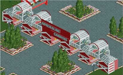
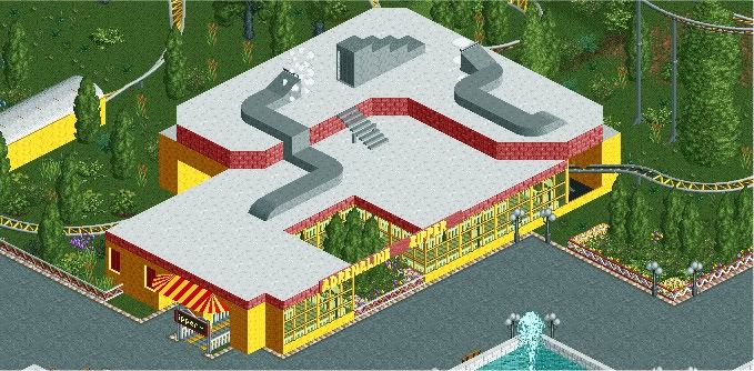
More from Adrenaline Gardens, I'll post a topic soon enough..
The Ticket structure.. I'm quite pleased with the feel I got with this...
The Adrenaline Zipper is the park's mini coaster, pretty fun build. It uses the bobsled cars.
Please note: both screens ARE unfinished.Edited by Luketh, 03 September 2009 - 04:31 PM.
-

 Cena
Offline
Not an exact copy, but the style and my hotel is inspired by it. Thanks.Grand Floridian, Cena?
I love that style of architecture so I really hope you're doing something like that.
What's there looks amazing anyway
(Credits are going to CedarPoint6 for this, he gave me the tip about the Grand Floridian)
 Tags
Tags
- No Tags

