(Archive) Advertising District / Dump-Place
-
 19-April 07
-
 jusmith
Offline
Foliage doesn't look as good as it could. You've only used a couple tree types, so it looks kind of monotonous to me.
 -

 Cena
Offline
Louis, first screen the foliage is a bit messy but still it is very pleasable.
Second screen is just superb (The woody design right?)
SSSammy, really good I like it
  I think your support style is really cool
-

 JDP
Offline
Samster, it's cute and elegant, but it doesn't have anything that reaches out and grabs me. I understand your attempting to get a nice style and look but I don't think you can pull off a design with what you have going there. i have to agree with Kpult on it being bare and boring. I hope you add a lot more to your areas and making them more entertaining to look at (espically if you're shooting for design).
Oh and put a support blocker below that hill since you have a support unblocked
Good luck bud.
-JDP -

 Todd Lee
Offline
^I agree SSSammy, I really like the support work. The livestock and barn are great too.
 -

 zburns999
Offline
Okay, I don't think I get what you're showing SSSammy. It almost looks like an early Schwarzkopf, judging by the supports and trains and whatnot...but it seems to be missing those bulky catwalks that make that style of coaster recognizable.
http://www.rcdb.com/108.htm?p=4851
http://www.rcdb.com/130.htm?p=5701
And I almost feel like mini-coaster track would suit the style better. But, just a suggestion. I don't know what you're going for or if realism is a goal at all here. -

 Liampie
Offline
It almost looks like an early Schwarzkopf, judging by the supports and trains and whatnot...
Or like a custom, like the Ultimate at Lightwater Valley. -

 SSSammy
Offline
does everything really have to be extrapolated from real life zburns?
its influenced by a pic i saw on RCDP but cant seem to find.
whilst i try to be realistic, is it really a necessity?
Hepta: thanks, i hope theres enough in there
Jusmith: sorry youre not impressed, hopefully upon release this will be more appealing to you.
Cena: thansk
JDP: thanks, ill try and sort that for ya.
Guy Smiley: thanks man. glad you like my goats
-

 Comet
Offline
Just some things to help clean it up a bit...
Make the footers gray, choose a different fence because I always thought that was meant more for building decor, and do something with the flowers. Not too sure what but I think making them solid colors would help a bit. -

 zburns999
Offline
does everything really have to be extrapolated from real life zburns?
No. That's why I said...But, just a suggestion. I don't know what you're going for or if realism is a goal at all here.
I don't know. You put a whole hell of a lot of effort into making the supports realistic. I thought I was making a fair suggestion that you follow through with other aspects of the ride. Whatever. I guess I'll just post something like "SSSammy, I <3 it!!!" instead of trying to help. -

 SSSammy
Offline
No. That's why I said...
I don't know. You put a whole hell of a lot of effort into making the supports realistic. I thought I was making a fair suggestion that you follow through with other aspects of the ride. Whatever. I guess I'll just post something like "SSSammy, I <3 it!!!" instead of trying to help.
seems i misunderstood you.
sorry mate. i dont like them saying that either. cause i know it aint perfect.
i put a whole lot of effort into making the supports look visually appealing.
-

 zburns999
Offline
^Hey no problem dude. Didn't mean to be a douche if that's how I came off. But yeah, I'm looking forward to seeing this either way. Those goats alone make me happy.
 -

 JDP
Offline
^Dude you have to be a douche more often!
JDP
Offline
^Dude you have to be a douche more often!I guess I'll just post something like "SSSammy, I <3 it!!!" instead of trying to help.
Yes, that. That was just hilarious.
Awesome.
-JDP -

 nin
Offline
Okay, here's something that was originally going into my sfmm remake, but is being scrapped for a new coaster which I've decided to keep in the park.. It was meant to be an outdoor/indoor exhibit hall featuring baboons, elephants, and other smaller African animals like reptiles and fish (an aquarium bit was planned). It's based off of Africa Hall at Zoo Dresden, so if any of you have been there, then hopefully you'll see some sort of connection.
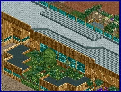
Outdoor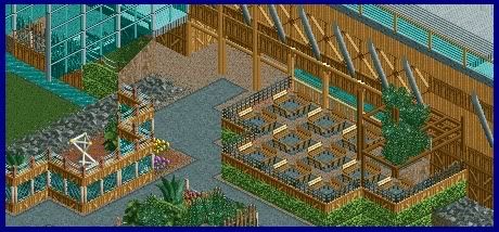
Indoor
and yes, the roof was going to be removable so everyone could see what was hidden inside. -

inVersed Offline
I wanted to wait to show much of this, but fuck it. I have grown impatient!

Credit goes to Geewhzz for making the frisbee and letting me use it in Innis Gardens.
Here's a status update on all my work:
Innis Gardens is going really slowly or at least it seems that way (as always with 200x200 maps). Not really feeling all that motivated to work on it right now since I build best when I can focus play for long periods of time at once and not in short spurts like I have now been forced to do because of work and school. Construction will pick up to the level it once was when I get a bit more settled back in school (and after I have taken the ACT next week)
I have another significantly smaller project that I have been building during these "spurts" of RCT time. I will officially announce it to celebrate my 2000th post.
edit- my bad nin for posting so closely behind yours. you slipped in and posted your screens while i was working on my post... they look extremely impressive as always too!
 Tags
Tags
- No Tags


