(Archive) Advertising District / Dump-Place
-
 19-April 07
-

 Katapultable
Offline
I'm not sure if I could sit there and enjoy a meal, but whatever. It's a nice screen, but I agree with Casimir.
 -

 Luketh
Offline
Are you kidding me? I'd love to eat there and chuck a few fries at people on the ride..
But yeah, the support colors need to be differnet, like Casmir said. -

 Liampie
Offline
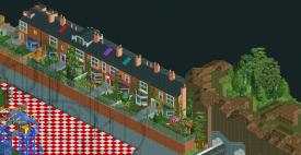
I don't think the supports look bad here and I like how the flowerboxes are used.
Liampie
Offline
I don't think the supports look bad here and I like how the flowerboxes are used.Edited by Liampie, 30 August 2009 - 11:56 PM.
-

 Fr3ak
Offline
colored things on roof top?
What's that supposed to be?
The rest is nice.
And I especially love the mountain =) -

 J K
Offline
I must say that last screen was the most english creation I've ever seen in RCT. No one has ever got an english theme right and in my opinion (and having been to blackpool several times and knowing what our country is like) that is a fantastic recreation of the residential buildings the area holds.
I'm really really impressed and happy that this park is reaching the potential of what blackpool holds.
Just make sure you have plenty of rock stands dude.
-

 Liampie
Offline
I also noticed the houses look [b]really[/]b English. I didn't mention though, because as a Dutch I could be easily wrong. Apparently, I was right though. It just looks so real...
I suspected the coloured roofthings to be veluxthings, but I think it's better if you make them smaller in height. Maybe you could make some windows without the blinds too, that would make it even clearer.
 Tags
Tags
- No Tags


