(Archive) Advertising District / Dump-Place
-
 19-April 07
-

 SSSammy
Offline
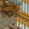
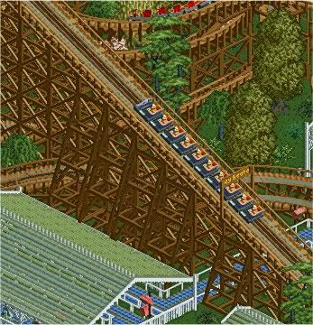
yeah the actual path part isnt done, just figured id post a rtectangualr screen instead of a craply cropped one for a change. thanks.SSSammy you can't count on all your guest being intelligent enough to not climb up the rollercoaster, what if, for example, Kevin visits the park? Some fences would stop him, and everyone else who lacks the ability to think. These supports looks a little wierd to be honest, mostly the lowest one, a bit thin. Place some more diagonal deco pieces in the supports (looks like you've forgotten some places) and it will look just fine.
thanks ripSSSammy Love what ya got there altho i agree about the supports.
haha, you really have to see the bigger picture to see how everything harmonises.I really like the supports, but the diagonal path looks weird imo.

or maybe not harmonises in my case, ha.
thanks yannik
ill try and sort that stuff nokia, thanks for the comment.supports look to week.
and a safety fence, por favor.
i got a feeling this is gonna be finished real soon. -

 RCTNW
Offline
^ What color do you recommend? Personnally, I think it looks fine and adding any other color would make it look forced.
Turbin3 - Very nice -

 MF72
Offline
I think some more red in there would look good, but otherwise, I think it looks great Turbin3.
 -

 Sey
Offline
It's obvious some bright colours would refresh this building considerably.
What about using a stronger red and orange? And especially another green for the foliage, it doesn't look natural that way.
-

 Casimir
Offline
Brown is the new gold, uh? ^^
I'd use some red, but please don't choose the bright one.
And I made some good experiences with a sliiiiiiight amount of the strong-ish blue.
I'm digging the structure, btw! -

 tracidEdge
Offline
that shit is beyond stupid, nokiaoh suck a dick tracid, idfc if i spelt it wrong.
-

 Steve
Offline
This coming from the guy who doesn't use capitalization and uses minimum punctuation in his posts.that shit is beyond stupid, nokia
Making fun of people for spelling mistakes on a message board was funny five years ago.
Nokia, for what it is worth, I really enjoyed your newest screen. -

 Cocoa
Offline
This really is just 'dump.' I think I like this, but I have absolutely no idea what I'm going to do with it. I might just save it and not use it.
There was a little more on the side but I didn't really like it. very unfinished if you couldn't tell...Edited by Cocoa, 28 August 2009 - 05:24 PM.
 Tags
Tags
- No Tags
