(Archive) Advertising District / Dump-Place
-
 19-April 07
-

 In:Cities
Offline
^great example.
and i know you said you dont really want to use some quartertile blocks, but dude, those 1/4 tile land blocks are always really helpful for building mountains as well.
i built some mountains like that in my Ivalice park (which is sitting at about 99% completion right now!), and i could probably take a small screen to give you an example of what i'm talking about.
its all about making it flow:] -

 Casimir
Offline
I'm usually a fan of those landblocks, but I think it's overdone here. Looks like lego.
I'd throw in some usual raised landtiles, to mix it up a bit. -

RMM Offline
1/4 land blocks have always bothered me in rct2.
they're in the game to create certain features.
not the entire mountain/landscape. use em sparingly when you need them.
it sucks. -

 Wanted
Offline
As a matter of fact Kong geewhzz didn't pick up the bong. Neither did I. Ever. Shut the FUCK UP
 -

 Splitvision
Offline
Looks like the waterfall mysteriously climbs its way up the mountain at one section, beside the built-in building. And I agree with Casimir, looks like Lego.

Hope you like + unfinishednessEdited by Splitvision, 26 August 2009 - 06:52 PM.
-

 gir
Offline
The potted plants, palm trees, and statues are hideous, I'm sorry. Also, is it an optical illusion, or should the gate be more or less centered in the tile instead of up on the edge?
 -

 Ripsaw
Offline
SV i like the idea of what your going for but in my opinion it looks a little too...Age Of Empires/Zoo Tycoon if you get my drift..
By all means carry on because it looks nice but i think there are certain aspects that are pulling it down.
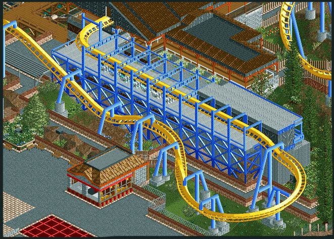
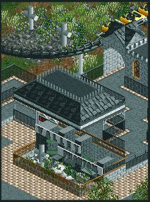
Heres 2 pictures for you nice people
First is the Breakrun supports now painted instead of the gray metal
The next is the Sign for the arrow multilooper, with its crypt/gothic theming
Edited by Ripsaw, 27 August 2009 - 03:28 AM.
-

 misterthom
Offline
@sssammy: thx
@casimir: i ill do that
@rrm: i disagree with you . but its your opinion.
i personally think they are for making more detailled landscapes.
@splitvison: there is a fountain there. but you cant see it on the screen. -

Airtime Offline
I really like it Ripsaw.
I'm not sure about the fencing in the first screen. In the bottom right corner aswell, I think there's to much grass maybe you could put a bit more foliage in there?
The second screen is also great but I'm not sure about the path that surrounds the sign (probably becuase I never did like that path.) lol.Edited by Airtime, 27 August 2009 - 04:14 AM.
-

 Splitvision
Offline
Ripsaw that looks very good, I've liked the screens you've shown lately, looks very promising. I'm with Airtime on the fencing though. I can see what you mean with the "Age of Empires" look, but I think that once you see the whole thing in-game, instead of those separate structures, it won't have that look.
SSSammy you can't count on all your guest being intelligent enough to not climb up the rollercoaster, what if, for example, Kevin visits the park? Some fences would stop him, and everyone else who lacks the ability to think. These supports looks a little wierd to be honest, mostly the lowest one, a bit thin. Place some more diagonal deco pieces in the supports (looks like you've forgotten some places) and it will look just fine. -

 Katapultable
Offline
Splitvision, on Aug 27 2009, 03:41 PM, said:

SSSammy you can't count on all your guest being intelligent enough to not climb up the rollercoaster, what if, for example, Kevin visits the park? Some fences would stop him, and everyone else who lacks the ability to think. These supports looks a little wierd to be honest, mostly the lowest one, a bit thin. Place some more diagonal deco pieces in the supports (looks like you've forgotten some places) and it will look just fine.
Hahahaha! Agreed. -

 Ripsaw
Offline
thanks for the comments
SSSammy Love what ya got there altho i agree about the supports.
About the fence are you saying i should remove the steel fence from behind the wall on the final turn?
It was really a saftey feature lol -

Airtime Offline
No I don't think you should remove the safety fence I mean I'm not sure I like the other fence. Sorry, lol. The combination between the brick wall and the other fence/wall.
 Tags
Tags
- No Tags


