(Archive) Advertising District / Dump-Place
-
 19-April 07
-

 Lowenaldo
Offline
 [/img]
 [/img]
i know its not much. supports arnt doneEdited by Lowenaldo, 24 August 2009 - 04:26 PM.
-

 Cocoa
Offline
One of your tree trunks is gold, and make that water blue. some extra foliage is nice, it's sort of bare, and custom supports would be nice.
 -

 Jaguar
Offline
Here is Disney's Imagination Station, I know the buildings are blocky, but its Disney. I am not using quarter tiles for this.
The Matterhorn
 SCR1.BMP (469.76KB)
downloads: 82
Buzz Lightyear's Spaceranger Spin
 SCR2.BMP (469.76KB)
downloads: 76
Tomorrowland
 SCR3.BMP (469.76KB)
downloads: 58
Space Mountain
 SCR4.BMP (469.76KB)
downloads: 56
The Haunted Mansion
 SCR5.BMP (469.76KB)
downloads: 61
Bald Mountain & The Shadowlands
 SCR6.BMP (469.76KB)
downloads: 66
Overview
 SCR7.BMP (469.76KB)
downloads: 50
Plaza
 SCR8.BMP (469.76KB)
downloads: 48 -

 In:Cities
Offline
^just because something is Disney, that isnt an excuse for it to be blocky.
haunted mansion looks pretty nice, but maybe consider adding some sort of a fence or border to the roof.
the edges look a bit strange to me.
and as for the shadowlands thing, man, jagged rocks dont look good.
well maybe i should rephrase: always putting jagged rocks as fillers doesnt look good at all.
i have never seen rocks like that in real life in any park. Especially in disney parks.
just maybe smooth them out a bit and work on adding some foliage. -

 Jaguar
Offline
^just because something is Disney, that isnt an excuse for it to be blocky.
haunted mansion looks pretty nice, but maybe consider adding some sort of a fence or border to the roof.
the edges look a bit strange to me.
and as for the shadowlands thing, man, jagged rocks dont look good.
well maybe i should rephrase: always putting jagged rocks as fillers doesnt look good at all.
i have never seen rocks like that in real life in any park. Especially in disney parks.
just maybe smooth them out a bit and work on adding some foliage.
Yeah, but in real life, disney buildings are just big boxes only decorated on one side. With bald mountain, I'm not going to put foliage in in, its called bald for a reason, thanks -

 In:Cities
Offline
oh okay.
you make perfect sense!
good luck grabbing one of them accolades bro!Edited by In:Cities, 24 August 2009 - 08:38 PM.
-

 Steve
Offline
People like you further cause me to lose faith in all of humanity.Yeah, but in real life, disney buildings are just big boxes only decorated on one side. With bald mountain, I'm not going to put foliage in in, its called bald for a reason, thanks
-

inVersed Offline
I usually don't think of "blocky" when i think of disney's architecture. I think of very elaborately detailed facades, with just as dramatically themed interiors. But hell what do i know?
Obviously, you have a lot of your own concepts for this park, but I would recommend that you look at "good" disney parks such as Iceman's disney parks and Meretrix's disney parks to get ideas on how to go about executing the whole disney style
Please lose the fucking jagged rocks! We are not bullshitting when we tell you this. They really look awful, but it seems like you don't want to liste. -

 Ripsaw
Offline
Ok i have no idea what cohesion means Liampie, but ill try not to do it? lol
Now i know its not like B&M to only have 1 transfer track in the maintenance shed but to be practical its what ive had to do and anyways i dont think it looks to bad.
Heres is the Soar with the transfer completed.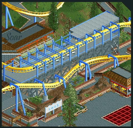
-

 Liampie
Offline
Ok i have no idea what cohesion means Liampie, but ill try not to do it? lol
Really? It's like unity... -

 Brent
Offline
What if he asks what unity is?
Anywho, keeps getting better and better... keep up the great work. -

 K0NG
Offline
i like them
Ok, two days in a row here Gee....first you dare to disagree with Cena and now you say you actually LIKE all those jagged rock tiles? Did you happen to venture a bit north of SFMM when you were out here and hang out with Travis and his bong for a bit?
And jag, even bald men have a few random hairs scattered about their shiny domes.Edited by K0NG, 25 August 2009 - 01:36 AM.
-

 Xophe
Offline
Ripsaw that is NICE! The only slight issue I have though is that the transfer area is so visible from the path. You have this cool logo by the entrance with the track swooping over the queue but then there's a big ugly wall of grey supports behind it. Maybe you could disguise that somehow?
 -

Tezee Offline
It really looks fantastic. Ripsaw. This "big ugly wall of gray supports" You should really replaced by anything else.
The Coaster is harmonious with the environment.
I hope my English is not too bad. -

 Lowenaldo
Offline
holey moley, jag kid, get rid of those rocks, and visit a disney park or look up pictures, because right now all your buildings are blocks. also ,you should listen to the comments giving to you by the more experienced players, considering they are better then you and trying to help YOU to become better. dont be ignorant. thats all.
rip: every picture i see of soar i fall more in love with it! i dont see hwtas wrong witht the grey supports? are you planning to send this in for design or is it park of a larger project?
 Tags
Tags
- No Tags
