(Archive) Advertising District / Dump-Place
-
 19-April 07
-

 Gwazi
Offline
with the screens you've been showing lately, i honestly couldn't give a bigger shit. gorgeous.and yes, i do other work besides no custom scenery.

-

 Ripsaw
Offline
Inversed that screen is sublimly beautiful! everything fits so well and im glad you keep with that tower and not the Ingame track =]
Ok 2 screens for you peeps today!
First is for those who wanted to see the logo better..its suposed to be a sorta rock formation in the form of wings.
Notice also the queue entrance has changed.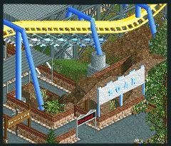
The Second screen is just a general update
Sorry if it looks like not much has happened i just liked the screen and thought i would share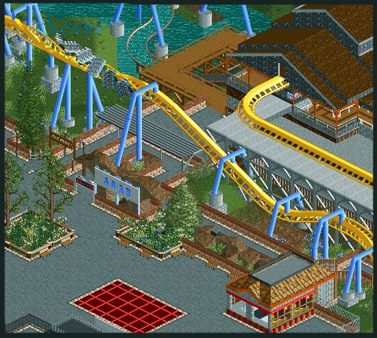
-

 Cena
Offline
Ripsaw, I don't get your advertising strategy ... You are always posting big screens etc, where you show 98% of the ride already. What is the fun now, when you release it and we will be downloading it? Then there would be no fun, right?
 -

 Ripsaw
Offline
In what way have i shown 98% Of the ride, thats only the last section ive shown, and tbh this is only screens the real fun,well for me anyways is watching the ride in motion.
 -

 Bacchus
Offline
Can you please stop telling people what to do Cena?
There is no good or bad if it comes to advertising. Everybody should show whatever the fuck he wants to. And even if you show 4 full size aerials from 4 different angles, there will always be things in parks that only can be viewed in-game. -

 Nokia
Offline
^ahhhthankyou.
screens look great ripsaw, but i think the breakrun wants some supports too
-

 Katapultable
Offline
Can you please stop telling people what to do Cena?
There is no good or bad if it comes to advertising. Everybody should show whatever the fuck he wants to. And even if you show 4 full size aerials from 4 different angles, there will always be things in parks that only can be viewed in-game. -

 Comet
Offline
^I agree with that, I also think it's better to use custom objects for the parking spaces. I just don't really like the broken up path, try out the deco pieces maybe if you don't have the particular object.
The coaster and supports look great though. -
 Jaguar
Offline
To tell you all the truth, I'm getting a little sick of seeing the same types of coasters all the time, I want to see some unique coaster types!
-

 Liampie
Offline
I haven't seen many Intamin Megas lately, this was a pleasant surprise!
Nin, your last screen was outstanding. Perfect use of trackitecture.
Bender, I like it unless you make a whole area with square buildings. It might end up as blocky, but I cannot judge now.
Stanman, I like your screen too.
Cocoa, excellent! You really impressed me with your recent screens.
Jazz, I like everything you do. I can't wait to see some close-ups or a download! Finish it, and make Jazz a NE parkmaker!
TwistedHelix, very enjoyable!
InVersed: It's bare but I have the feeling that it works great when seeing it ingame.
Ripsaw, it's very good. The only flaw is cohesion, but you're visibly improving. I like the coaster's colours.
Tezee, I dislike the dull colours and the steep catwalk, but not in a distracting way. It's enjoyable.
The last few pages here have great screens among them, bring it on! -

 K0NG
Offline
maybe he likes it.
C'mon, Gee...you know that the only opinion that truly matters around here is Cena's. -

 Liampie
Offline
Airtime: Sorry! Without custom scenery it's very hard to distinguish people's styles, especially when it's trackitecture!
K0NG: True.
 Tags
Tags
- No Tags
