(Archive) Advertising District / Dump-Place
-
 19-April 07
-

 Jaguar
Offline
RCTCA, I don't know if it is finished, so I guess I can't really criticize it. Nin, that carousel looks kinda cluttered, You should build a more traditional styled park, kinda like mike robbins' magnolia gardens, it looks simple and fine, though that style is out of date, it looks good because of simplicity.
 -

inVersed Offline

Dippin' Dots are popular with some of the guests at Innis Gardens
"Innis Gardens: Not a theme park, but a dream park" -

 Ripsaw
Offline
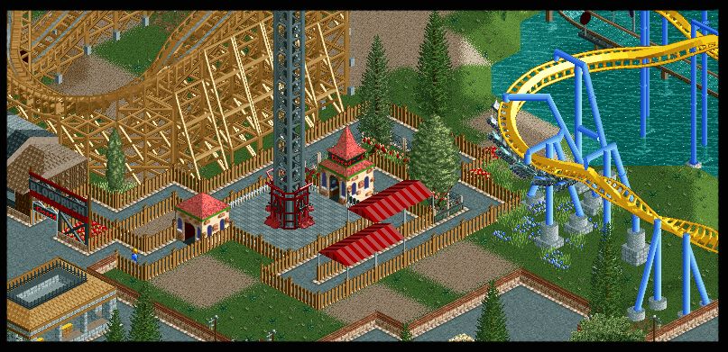
Ok in the past i have been acused of showing too much....so im sorry i was gona reveal the layout but ill do a little shot instead hahahaha
The Flyer is Soar! -better name needed
and its not a new project,as it in the same was planned design park -

 posix
Offline
ripsaw, liking it, as always. the flyer going over the queue is a bit weird though. i think you wanted this but it isn't designed consequently enough. an interaction like this needs more polish somehow.
i love how you always do these big signs at ride entrances. that's really convincing and realistic to me. really hope to find something from you in our inbox soon. -

 Comet
Offline
There's always something about your screens that I love, but just as much I see so much that can be improved.
I can't put my finger on any of it though. -

 Comet
Offline
Looks good.
I'm not too great with peep knowledge but I think you should just have one straight path for them to get into the park, going from the actual ingame entrance through the tickets then under the park entrance and into the park. Maybe I'm wrong though. -

 Brent
Offline
Is that supposed to be ticket stalls, or the actual entrance? If it's the entrance, doesn't quite make sense to have it open on the sides like that.
 -

 rct2_tom
Offline
Good start:
- Remove the brick walls around the two trees.
- Raise the arches a little bit.
Idea:
- Maybe it's a good idea to use more flowers on the sides, just an idea... -

inVersed Offline

So here is an early prototype of a Pilgrim's Plunge-esque water ride that I want to feature in Innis Gardens but I am just not sure about the supports, but after studying Pilgrim's Plunge this is how they seem to be except Pilgrims Plunge has a forth straight support a bit farther down the drop.
One thing that I could not figure out how to build was the double lift like on Pilgrims Plunge
There are still several essential details to be added (such as splash basin, mechanical lift system, lift dock bay, tower footers, and theming).
One thing that stood out to me on my research of Pilgrims Plunge are that the water basins leading up to the lift tower and after the water pool are simply thin curvy concrete pieces (as seen here) so I think it would be appropriate to just use the splash boat track pieces proved by the game.
What I really want advice on is whether or not the actually tower and support structure look realistic enough.
If you have no idea what i am talking about when i mention Pilgrim's Plunge, this should help
 Tags
Tags
- No Tags


