(Archive) Advertising District / Dump-Place
-
 19-April 07
-

 gir
Offline
Ahh perhaps I should rephrase--by name I meant guess.
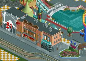
Thanks for the comments everyone. Steve, I will definitely add more seating, thanks. I'm glad everyone likes the counters, too. They're something I've been doing for a while, but of course I never finish anything so I guess no one's seen it from me.
-

inVersed Offline
gir, i dunno what it is, but there is something about every screen you show that i love. this is no exception. -

 ACEfanatic02
Offline
Mellow Mushroom? Or something similar.Ahh perhaps I should rephrase--by name I meant guess.
Building looks a little short for its size, especially with the trackitecture sloping down. Maybe raise it 1 or 2 units?
-ACE -

 Lowenaldo
Offline
i really like it sammy! i have a question with zero clearance, whenever i seem to use it, the new objects kinda overlap the old ones and kinda creat an odd looking wall/floor/roof/etc. i was wondering if there is any way to get rid of it? i posted a sample picture below.
 [/img]
-

 Stanman
Offline
Thanks for the support on my pic again, I really appreciate that.
Some new pics might be up soon.
----------
nin, the helix looks crappy... and i don´t like that long diagonal part.
Try this:
-

 Six Frags
Offline
Shame you couldn't finish Southport like that, rrp, otherwise it would've crushed Roman Vice..
Your architecture seems to have improved majorly. I hope you are not using RCT Modified though. With Geewhzz hack topic you wouldn't need it anyway..
Looking forward seeing the improved version completed!
SF -

 RRP
Offline
Shame you couldn't finish Southport like that, rrp, otherwise it would've crushed Roman Vice..
Your architecture seems to have improved majorly. I hope you are not using RCT Modified though. With Geewhzz hack topic you wouldn't need it anyway..
Looking forward seeing the improved version completed!
SF
I am using modifed but only to remove bases.The station entries are removed so anyone without RCTM will just miss out on certain flat ride base additions -

 gir
Offline
Really quite stunning RRP, you never fail to impress. I especially appreciate the flowers out front, they're just so natural.
ACE: Correct--and I raised the building up a block and it does indeed look a lot better, thanks.Edited by gir, 12 August 2009 - 08:08 AM.
-

 Brent
Offline
Thanks for the support on my pic again, I really appreciate that.
Some new pics might be up soon.
----------
nin, the helix looks crappy... and i don´t like that long diagonal part.
Try this:
I don't think you got what he was going for there....
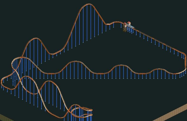
I like it, one of my favs coasters ever. Doesn't look like you have that lil hump curve at the end going into the brake run though. Still a pretty solid rec. -

inVersed Offline
Oh shit, nokia! This is great. What you should do with this is finish this! I love what I am seeing here.
 Tags
Tags
- No Tags


