(Archive) Advertising District / Dump-Place
-
 19-April 07
-

 Katapultable
Offline
LDW: maybe a bit overdone with that thing.
In:Cities: That is awesome, but you'll need more supports under those speedslides.
Stan: You're becoming one of my favorite parkmakers. Build faster! -

 SSSammy
Offline
[font="Impact"]CROPPING FAIL[/font]
the bottom corners are where the time/money tings where. copyinh and pasting grass and water has never been so crudely performed.
thankyou. -

 In:Cities
Offline
sam, you really should play rct2 more often.
this looks fantastic:]
haha this is still the zelda-ish park right? -
 turbin3
Offline
Sammy, great screen, I love the supports.
But the foliage destroys the great screen for me.
-

 SSSammy
Offline
thanks man, too kind.sam, you really should play rct2 more often.
this looks fantastic:]
haha this is still the zelda-ish park right?
and yes.
zelda-ish park it is.
glad you picked that up (h)That coaster looks really retro!
thanks alot, ill try to sneak more colour in there. though i think this might be the last screen before i release, its only abut hlaf done atm.Impressive. I would like to see more. (and maybe some more color too)
thanks, the supports are popularI don't like your foliage. The supprts are good, though. Needs more color too.
 like i said ill get more colour in via contraband. i wasnt really very keen on the fliage either, but i wanted it to be like this place in the lake district which i love, alot, and i think i pulled it off. but whats the point in realism if it looks shit, ill take another go at it.
thankssss yannik, like i said ill take another crack at that foliage for you guys.Sammy, great screen, I love the supports.

But the foliage destroys the great screen for me.
-

 Nokia
Offline
im not sure about the supports sammy, the lift supports look okay, but the rest of the coaster....eh.
 -

 Steve
Offline
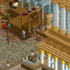
gir, it looks excellent. I love the "take-out" window counters. I would suggest maybe some seating/canvas covering on those path roofs.
 -

 Liampie
Offline
That idea with the counter, on the right is genius.
Yeah, those ideas are spotlight material. I like the bright colours in the screen.
For the name, try Fungus Foods.
 Tags
Tags
- No Tags
