(Archive) Advertising District / Dump-Place
-
 19-April 07
-

FullMetal Offline
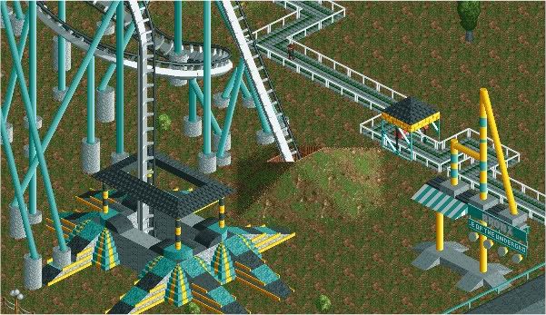
I actually tried that at first, but I thought it looked a awkward, so I went with the 4D catwalk. If I had added Phatage's custom catwalks, I would do that, but I didn't think of them at the time. And I'm too lazy to Dimport.I'm really liking that station, FullMetal--though it is a lot of grey. Also, a one-sided catwalk seems more appropriate.
That comment makes me feel all warm and fuzzy inside. Thanks!FullMetal it sure is nice to see how much you have improved at this game
Yeah, I still need to add some of those, but I didn't know what color I should use. Thanks for the suggestions! And this one has grass. http://www.rcdb.com/907.htm?p=6652I wouldn't really put grass under that type of ride.
Also, maybe add some (red?/yellow?/black?) canvas covers to the queue.
Very nice though. -

inVersed Offline

"Stuntman: can you stand the role?"
"Innis Gardens: Beautiful Landscapes, Horrendous Thrills" -

 SSSammy
Offline
"Innis Gardens: Beautiful Landscapes, Horrendous Thrills"
slight issue with the Horrenous thrills part.
what the line says to me is, nice looking landscapes, shite thrills.
maybe a different adjective? -

 Cena
Offline
Come on inVersed, that is not a screen anymore, that is a avatar. It shows 4 objects to me, not anymore
The slogan is cool btw. -

 In:Cities
Offline
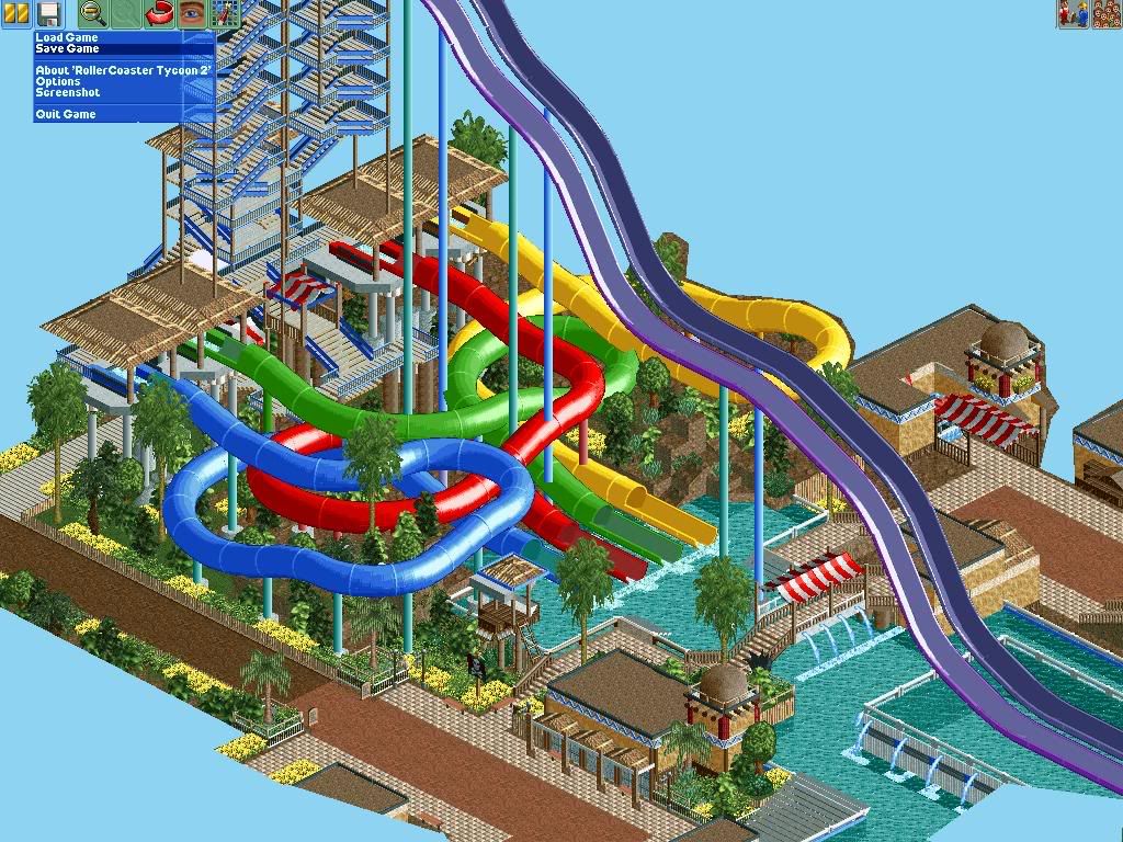
an updated version of that previous picture:]
its still a bit sloppy, and lacking in many areas, but i think its coming along pretty decently:] -

 LDW
Offline
Cool, I'm looking forward to the final show.
Here's a little screen:
Enjoy! (unfinished) -

 RamSam12
Offline
Holy shit those slides are huge. If you plan on keeping them that high, I think they would work better either as just one long drop instead of airtime hills, or with the first part of the slide enclosed. Really love that atmosphere you have going as it reminds me of a waterpark in an old project I had going once.
 -

 Lowenaldo
Offline
im not really a fan of those purple slides ether, but everything else looks good, and turbin, im assuming thats going to be on the front page soon
-

 Liampie
Offline
In:Cities: I was 'afraid' you started to built realism, but I think I have to take that back. Those slides are impossible but I do like them!
One thing though; the colours of the slides and the tower don't fit the (beautiful!) landscaping/theming. -

 Brent
Offline
In:Cities, needs moar supports... on both the speed sliders and the stairs heading up to them. Love everything else though.
 -

 In:Cities
Offline
lol thanks guys.
its still very unfinished, so more supports will be added soon.
and as for the colors, i'm actually pretty happy with them, and once you see the park as a whole, it'll flow together a lot nicer.
and yes, as for that slide, i know its a bit over the top, but hey, i wanted to make an over the top, crazy waterpark:] -

 Steve
Offline
besides the lack of supports, i fail to see the unrealisticness of the speed slides. maybe his park will have the new world's tallest and fastest slides?
 Tags
Tags
- No Tags


