(Archive) Advertising District / Dump-Place
-
 19-April 07
-

 Todd Lee
Offline
You gotta paint all the trains green (think turtles), but throw in an orange/white car (marlin) on 1 train, and a blue/yellow car (dorie) on the other train. Name the ride "The E.A.C."
 -

 Ozone
Offline
Probably 45 minutes or so, I had to redo a couple sections thanks to an error trapper.
 -

 tracidEdge
Offline
looking at it more closely, it definitely doesn't seem as time consuming as i thought. it's still neat as hell, though. I think it might look better with a different land type as the base of the building. I don't know what, but i've never liked the way the city stuff looked in this game.
 -

 Ozone
Offline
Yea, I didn't think the land part through really well when I started. Maybe I'll stack some more fences over it, what's a few more?
 -

 SSSammy
Offline
i feel there is a real texture clash in that screen Ozone.
its very clean and refined, and overall very impressive all the way up the tower, then we hit the bottom, and were into mario land, with all the grass and magnolias and flowers, combined with all the stupid city texture of the walls, it all becomes a little too much. it would benifit alot i think if we lost the magnolias.
apart from that, i am watching your projects very closely indeed... -

 Louis!
Offline
SRF - The screen is great, that is how Aquatica was meant to look but we didn't finish in time. Great stuff.
Ozone - Really nice, but the building seems to be lacking something, it seems to plain atm. -

 Ripsaw
Offline
SRF Lovin the scenery tbh i love the bright green, really adds to the neon coral effect=]
Ok i need some opinons, do i keep the woodie on its own and go for a design or......
Continue building with the Arrow Multi Looper Valley Phantom-name may change and go for some kind of park direction, personly i love the steely but please what are your views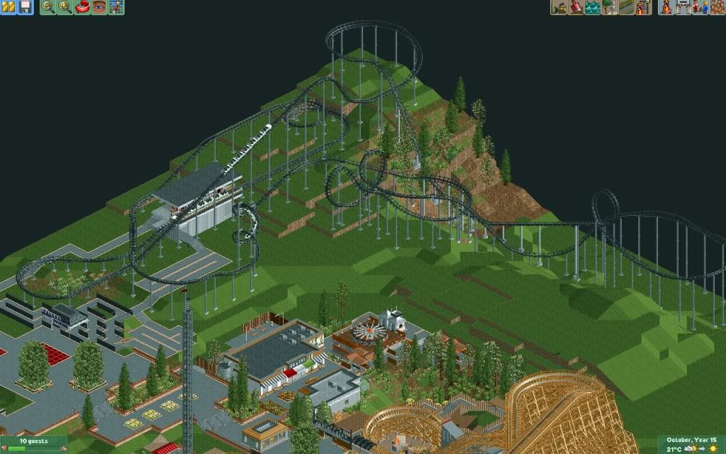
As you can see it has some terrain moments and 5 inversions. -

 Liampie
Offline
I like to coaster except for the colours. Dull, again... Maybe add a tunnel, too?
Make the project as big as your imagination allows you to. -

inVersed Offline
I had never realized you were so talented at coaster design until I saw these last few screens from your park. -

 Louis!
Offline
I don't actually like the layout and I would go with design as I'm still waiting for you to finish another project, so the smaller the better.
 -

 Hepta
Offline
Layout is pretty nice, but it seems to be lacking park interaction, and I don't really like that huge ass 30* hill up to the loop, but I guess that's necessary in the game.
 -

 SSSammy
Offline
one thing ive got to say Ripsaw, please stop revealing everything with screens, it will seriously take the edge off the downloads when it gets released.
i love the steely btw
-

 Cena
Offline
I hate it, sorry, but no, I don't like it.
Why is the coaster so put in the corner of the park? I think coasters should be a kind of centerpiece in a park That you can see from every direction
 Tags
Tags
- No Tags
