(Archive) Advertising District / Dump-Place
-
 19-April 07
-

 Comet
Offline
I really like the pre-lift because you didn't even need to use any drops for it to gain momentum, if you know what I mean.
The rest of the layout's really good too, I think you could pull off some really good interaction points with it.
The tunnel might look better as a trench though, not sure... -

 StormRunnerFan
Offline
I like the layout! I may not ride it but it looks like fun!
Another pic: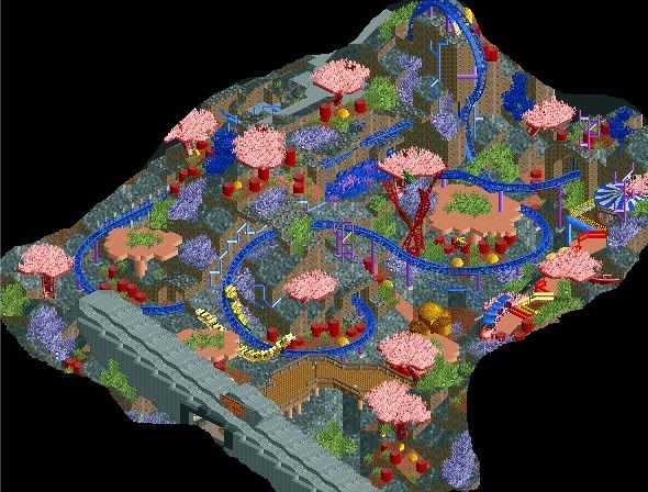
-Storm -

 posix
Offline
someone's pissed he sucks at realism.
but the layout isn't bad, from a purely rct-ish perspective. reminds me very much of one i did in an unfinished solo. -

 robbie92
Offline
SRF: Gonna sound weird, but needs more color. If you watch Finding Nemo, the reef is vibrant, colorful, and practically eye-popping. You have a start, but incorporate lighter blues, yellows, greens, and neonish pastels to make a bright reef. Right now, it's relying too heavily on reds, purples, and blues.
 -

 ACEfanatic02
Offline
tE: That looks fun as fuck. Moar plz. (Also, I thought you stopped playing?)
-ACE -

 JDP
Offline
Yeah tE, if you theme it right you can easily get a design. There's some really nice spots where you can incorporate some nice interaction with theming...
but we all know you ain't finishing it, and you'll only continue to tell everyone to "wait and see".
Right?
-JDP -

 zodiac
Offline
tE, the layout doesn't matter. what matter is whether or not you do something with it.
 -

 Gwazi
Offline
so tE, this mean you are gonna finish your solo now?
Gwazi
Offline
so tE, this mean you are gonna finish your solo now?Edited by Gwazi, 29 July 2009 - 12:05 AM.
-

inVersed Offline
Ripsaw, I really like that coaster layout. It seems really smooth and the tunnel looks very nice
tE, I hope you finish this
MF, that building looks pretty elegant I want to see more of this
SRF, I really can't wait to see this in gameEdited by inVersed, 28 July 2009 - 09:07 PM.
-

 RCTCA
Offline
so tE, this mean you are gonna finish your solo now?
(that's the unfinished suspended coaster from his old solo that he released unfinished if you didn't know)
I thought it looked familiar. I hope you finish it! -

 tracidEdge
Offline
gwazi shut the hell up it's a secret.
also posix, in case you can't read let me help you out. I literally give no fuck about realism, i don't like making it, i don't like looking at it, i never have. i've never tried making something realistic beyond ripping off kraken's layout. I know the hot thing around here is to make shit as real as possible, and wanted to get it out there that if anyone tells me its not realistic, i'm going to ignore them. -

inVersed Offline
I think I need a break from this LOL
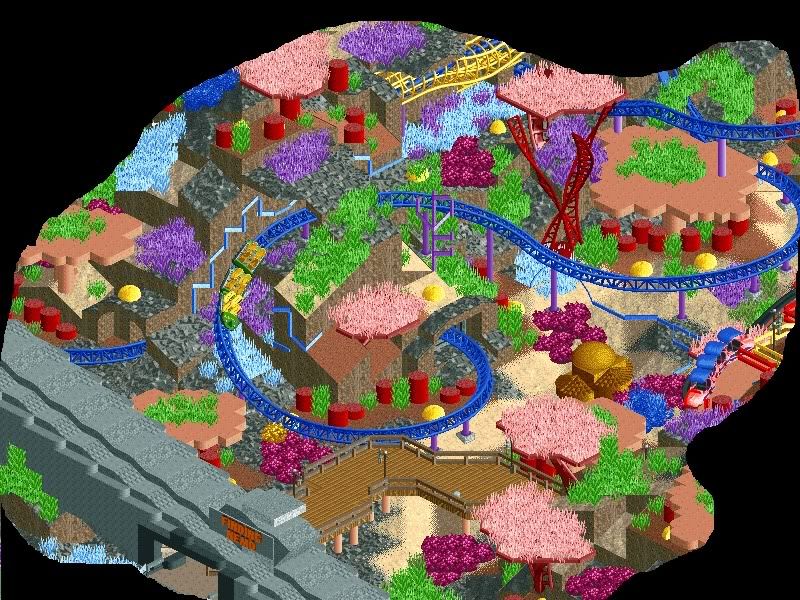
-Storm
Go with the other green you have been using. It looks better. The bright green is overpowering -

 Cena
Offline
^ Don't agree, if he put the waterobjects of Levis on top of it , then this looks better, because water makes it look darker, then this brighter is better if he adds the water objects, if not ... Then he should change it.
Screen is beautiful tough
 Tags
Tags
- No Tags


