(Archive) Advertising District / Dump-Place
-
 19-April 07
-

 Cena
Offline
Has Cena still not done it yet then?
Fixed, I think Posix has an submission now in his email by now ... (although, I hope he has) -

 Goliath123
Offline
Is that from wonderland? Very good screen btw, the fountain really makes it special, love the architecture on the right too i just dont understand why you have fences on the right?
 -

 J K
Offline
I love it fisch. I think the fences around the trees don't fit at all though. You have amazing quality of bright colours and detail in your architecture then broken walls which are a total contrast. Change them and it will be lovely.
 -

 Sulakke
Offline
That's a great screen Fisch. My only complaint is that the building on the right might be a bit too busy. The rest is really wonderful!
 -

 SSSammy
Offline
what he saidThat's a great screen Fisch. My only complaint is that the building on the right might be a bit too busy. The rest is really wonderful!
-

 StormRunnerFan
Offline
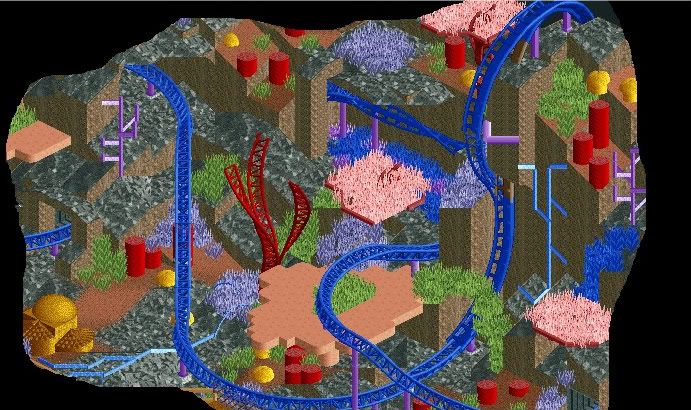
Something I put together this morning.
Finding Nemo
Little project Im workin' on. -

inVersed Offline
i dunno what it is, but there is something about that color scheme that i really like -

 In:Cities
Offline
is that supposed to be like an underwater scene?
it reminds me of the seafloor or something lol.
nice job on the colors though man.
i like it:] -

 SSSammy
Offline
Its a scene from
Finding Nemo
have you never LIVED?
freakuing epic film
epic screen
Edited by SSSammy, 27 July 2009 - 11:48 AM.
-

 In:Cities
Offline
lol whoops, didnt see where he put the title to it haha.
either way, it got the theme across very nicely:] -

 Fisch
Offline
I really like the idea but even though it's clear what you're going for you should get a definite color scheme down for the plants and all that. Right now it looks kinda like it should but the colors are a bit too random...like you don't know what the different colored plants are resembling. You don't have to know it but if you did you could do certain plants with certain colors more than others and the whole thing would have more of a purpose. Still it looks good. Good luck finishing it! Does the drop really work?
Thanks to everybody who commented on my screen.
Goliath123: Thanks! No it's from something else that will be advertised in ~ 1 week. They're just there to add to the whole picture. You could see it better if you were able to look at the whole thing.
J K: Thank you as well! Idk, I actually quite like them. I mean they're not really broken since there are no stones missing from them.
Sulakke: Thanks! I can see where your opinion is coming from because it's the only building like that in this picture. There are more that are like that one though so it doesn't look as much out of place.
inVersed: Thank you tons!
SSSamy: see answer to Sulakke.
Nokia: Thanks!Edited by Fisch, 27 July 2009 - 03:04 PM.
-

 Comet
Offline
Well you've improved.
It just needs to be cleaned up around the edges, literally.
Maybe get rid of the gray part on the roof as well, it's unnecessary and the other roof would look better there.
 Tags
Tags
- No Tags


