(Archive) Advertising District / Dump-Place
-
 19-April 07
-

 Liampie
Offline
Shit, NE is totally going oldschool it seems. Everything on this page could've been built years ago!
Airtime, on the one hand it's very beautiful, but on the other hand it's quite boring too. I'm especially referring to the last screen.
Comet, the right half of the screen is gorgeous. I dislike your foliage however, there's no flow. For a start try to avoid having similar looking trees next to eachother. That's not always wrong (most of the time it isn't), but in your screen I see three pairs of similar trees next to eachother. That's my main complaint!
I can't wait to see this kind of stuff released.Edited by Liampie, 25 July 2009 - 02:07 PM.
-

 Steve
Offline
Comet, that looks great! I like where the queue is headed and I agree with Liampie about the foliage!
 -

 Brent
Offline
Burns, that GCI looks great. I like the tunnel over the track over the road like on Ravine Flyer II. Any chance at seeing something like this at Duffys Lake?

I guess you could call this a look into the past if you know what this is based off.
Holy shit... Spin Out (as it was known @ SFMM). Never seen this attempted before and you nailed it. Just jaw-droppingly good.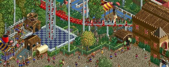
This is a pretty cool screen... reminds me of Xcelerator with Supreme Scream right next to it. Maybe add a control room?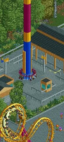
Heavily inspired from SFOG's tower... right down to the queue building and pathing layout (exit to the left). All you need is some lockers in there and someone trying to steal your hat as you're getting off and then trying to play it off as if they weren't trying to do so... >_> -

 Cocoa
Offline
reminds me of orphan rocker, comet. i was just down at scenic world. i wish that ride would be open...
 -
Airtime Offline
I like it Comet...
Coincidently this is made by Me but it's something from a park by Comet and Me from a while ago

-

 Video_Kid
Offline
^That looks great, and has a good atmosphere.
I do not theme flats at all, but I thought I would give it a try:
How does it look? -

 Goliath123
Offline
This park is turning out to be my best work, and its fun too

Edited by Goliath123, 26 July 2009 - 08:07 PM.
-

 Brent
Offline
^That looks great, and has a good atmosphere.
I do not theme flats at all, but I thought I would give it a try:
How does it look?
Whoever made that ride needs to be shot... maybe it's just the colors but that looks like total shit. But that's just the ride. For the surroundings I'd maybe have the train further back from it, and do some landscaping in the front of the ride (some bushes/flowers).
As for Goliath... amazing stuff there. Could've fooled me for Geewhzz. -

 Video_Kid
Offline
^
Amazing Earl did it. I don't think I've seen anyone else build a custom ride any better. -

 Goliath123
Offline
This park is turning out to be my best work, and its fun too


Yeah i quoted my self -

 ChillerHockey33
Offline
Yawn. Just another Black Mamba
But good, neverthelessEdited by ChillerHockey33, 27 July 2009 - 12:13 AM.
-

 Goliath123
Offline
its so brown.
So's black mamba, thats why i added yellow flowers to brighten it up a bit -

 tracidEdge
Offline
Okay. Black coaster, brown buildings, green trees (which honestly can't be helped) and yellow flowers. Great job on using 3 boring ass colors. Just because it's based on Black Mamba doesn't mean it has to be exactly the god damned same as it.
 -

 Video_Kid
Offline
Add a little bit of different colours like red and blue in places... maybe.
Overall, it looks excellent. -

 Liampie
Offline
Haha, not blue please. Instead of scattering the flowers all over the place, you could make a few much bigger flowerbeds with some 'fruity' colours as yellow, orange, red and maybe purple, all randomly mixed together.
The architecture looks good and coaster does too, but it's yet another Black Mamba...
 Tags
Tags
- No Tags
