(Archive) Advertising District / Dump-Place
-
 19-April 07
-

 Goliath123
Offline
Well in rct2 dont think it would look as nice because you don't normally use walls and paths for buildings on 2.
 -

 Louis!
Offline
^But it is an extreme no no to say that it looks good for LL. It causes multiple arguments.
Shammy, that screen is fantastic <3. And yeah I don't change anything or touch anything of your work, i'm just glad you take my advice
-

Colorado-Fan Offline
Maybe I'll finish this:
http://www.LupiUploa...03/ZodJgUAK.BMP
http://www.LupiUploa...03/M2CSDq1n.BMP
http://www.LupiUploa...03/OhDKzyO2.BMP
Nothing's finished at the moment. -

 Nokia
Offline
you and everyone else who tries to make of me because i tried to make rct2 look like ll.
 -

 ACEfanatic02
Offline
Nokia, LL doesn't look good for RCT2. But saying something is okay "for LL" is stupid too.
Because they're completely different games. Different modes of the same art. Comparing the two is a bit like comparing a watercolor and an oil painting. What makes Goliath's comment stupid is that he's saying "well, that watercolor's okay for what it is, but it's shitty as an oil painting." Well, no shit.
-ACE -

 RCFanB&M
Offline
You should all stop making such a big deal about OTHER PEOPLE comments and focus on helping the ones who posted a screen, by giving some constructive feedback.
Sammy I'm really liking what you've got there btw, I'm kind of a fan of glass stuff in RCT so yeah
Edited by RCFanB&M, 22 July 2009 - 02:02 PM.
-

 Goliath123
Offline
Does it really matter if i said it? I dont really see whats wronf with saying it because it just means that it wouldn't look good in 2.
 -

 sfgadv02
Offline
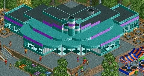
Very nice nin, once again it shows you can make beautiful things without custom scenery.
 -

 RamSam12
Offline
Nin, that screen reminds me of the old 50's style diner Denver's Waterworld used to have - being at a higher elevation than the surrounding path area. Good work for the use of only non-CS objects.
 Tags
Tags
- No Tags
