(Archive) Advertising District / Dump-Place
-
 19-April 07
-

FullMetal Offline
Wow, Top Gun! Great angle! See, that's what I really enjoy about RCT3: angle. You can put the camera in such awesome positions. I'd like to start playing RCT3 again after seeing all this amazing stuff, but I'm too lazy to reinstall it. Besides, my computer's not built for it.
@Whitehawk - Nice stuff. You used the Extreme Heights scenario, didn't you? It looks like you did. Nothing wrong with that, though. Even I enjoy playing a scenario park now and again. It's fun to play with limits, but it's also fun to play with no limits. One's more challenging, the other offers more creativity. So hard to choose...
Damn, I need to get back in the groove. I haven't really worked on anything in a few weeks. You guys are making me feel bad! -

 Louis!
Offline
Wow, Top Gun! Great angle! See, that's what I really enjoy about RCT3: angle. You can put the camera in such awesome positions. I'd like to start playing RCT3 again after seeing all this amazing stuff.
That's the only reason why RCT3 looks good. The angle. You can take a crappy RCT3 park and make it look good by using angles. That is why RCT3 is so crap. If you're good at taking screenshots/photographs then you are good at RCT3, if you're crap at that, you haven't got a chance. -

Whitehawk Offline
Fullmetal: Thanks! And, nope, it's a modified Create Your Own SF Park...I understand why you said that though, what with the last picture. And, actually, I agree, scenarios are a lot of fun to play with. -

 Gwazi
Offline
SSSammy, you're missing a fence, but i agree with ACE anyway
RamSam, glad to see a ride like Tom's Twister again. i miss that ride. -

Whitehawk Offline
I dont understand why you have two carousels in the same park. Overall it reminds me of a scenario
It could be worse. You could see the other section of the park that has a double carousel. And it could also not have peeps.
Secondly...Well, I take that as a compliment, as it is my impression that a scenario is supposed to emulate a real, functioning park. -

 SSSammy
Offline
thanks for the comments on my other screen.
meanwhile, from yet another project...
was this really worth 47 mins of my life? -

 RamSam12
Offline
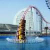
That, my friend, is a Rotor.@RamSam12: What exactly is that ride? Just curious.
-ACE
http://en.wikipedia....ki/Rotor_(ride) -

Colorado-Fan Offline

Maybe one of my new projects. It's inspired by the Hansa Park Sierksdorf with it's "Holstentor". This is the entrance area where you can buy your tickets. Don't know, if to go on working with this.
Hope you like it!
Colorado-Fan -

 jon
Offline
Looks pretty good. Your buildings look well made an has a nice atmosphere. i agree that theres too many ticket booths though, aybe cut it down to about half that and it should be perfect. Don't give up, I'd like to see this completed
 -

 ACEfanatic02
Offline
Heh, awesome.That, my friend, is a Rotor.
http://en.wikipedia....ki/Rotor_(ride)
Mind if I steal the idea for my new park?
-ACE -

disneylhand Offline
I don't like the way the wall trim along the roof meets with the slanted roof pieces. I also think it'd be worth it to match all of the slanted roof pieces. Also, there are better ways to do umbrellas that I've seen, IMO. It's nice to see you're still working on this park though.
-disneylhand -

inVersed Offline
I'm feeling the atmosphere in the screen steve. I think you should do something to break up the path at the right because now it looks a bit bland. Also consider putting a 1/8 block or something behind the walls at the top of the gift show so they dont seem so thin. I look forward to seeing more of this.
 Tags
Tags
- No Tags


