(Archive) Advertising District / Dump-Place
-
 19-April 07
-

 spartan
Offline
could use some landscape variation and some foliage.
BTW I like your KNEX coasters. awesome idea making an inverted one. -
 LDW
Offline
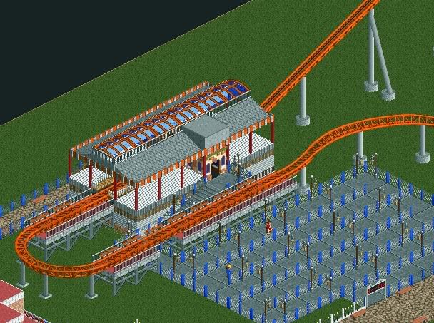
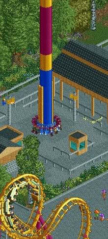
I like your screen nin but I think te drop tower needs some more fencing around it and the building on the right looks like 3 storeys when it is compared with the controls building. Good work!
-

 Katapultable
Offline
Nin, stop teasing us, already!
Start a topic for it, 'cause it's absolutely gorgeous! -

inVersed Offline
nin, can you hack it so there is no entrance building, then this would be perfect. This park is becoming one of my favorite parks in progress... how many coasters do you plan on having? -

 nin
Offline
...the building on the right looks like 3 storeys when it is compared with the controls building. Good work!

Are you sure it's not because of the trashcan to the side of it? The queue building is already meant to be the tallest building, but not 3x the size of the others.
Also, thanks everyone and inVersed ~8. -

 posix
Offline
nin, can you just finish something, please ?!
seriously, all your screens make me drool over my keyboard ... yet i never see a submission email of yours in our inbox. it's cruel. -

 BelgianGuy
Offline
How much I want to see a fully realised nin park!!!!
Please finish something in the near future
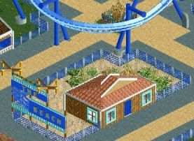
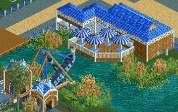
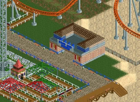
anyhow I've got some stuff I worked on as of lately so please tell me how I can improve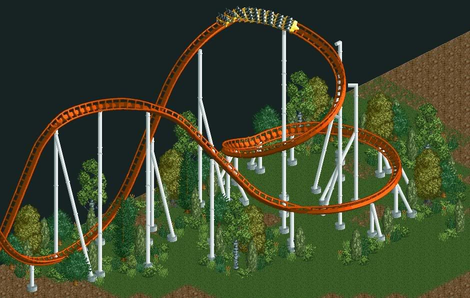
NOTE: still very unfinishedEdited by BelgianGuy, 15 July 2009 - 04:47 PM.
-

 Comet
Offline
There's not much but that's actually really really nice.
Love the colors, supports, layout, and foliage especially.
Now you just need to work on elevation change and adding character to it. -

 Maverix
Offline
Like Comet said, it nice but it's nothing special. Some land elevation would do that screen wonders.
 -

 Casimir
Offline
The only thing (apart from the landscaping) is that some supports aren't actually connected to the coaster itself.
You might wanna fix that ^^ -

 BelgianGuy
Offline
They are actually from another point of view, if I would make it otherwise it would look 2stories too low from another angle
and the landscaping wasn't even started yet because I've only worked on it for like an hour or so, what you guys suggest small hills or dramatic landscaping witha waterfall and such?Edited by BelgianGuy, 16 July 2009 - 01:32 AM.
 Tags
Tags
- No Tags
