(Archive) Advertising District / Dump-Place
-
 19-April 07
-
![][ntamin22%s's Photo](https://www.nedesigns.com/uploads/profile/photo-thumb-221.png?_r=1520300638)
 ][ntamin22
Offline
actually the analogy was for the 'crazy good' commercials.
thanks for playing. -.-
nice stuff alex.. the pyramid's a little bland, but the other one looks pretty good. -
![][ntamin22%s's Photo](https://www.nedesigns.com/uploads/profile/photo-thumb-221.png?_r=1520300638)
 ][ntamin22
Offline
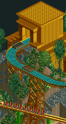
ouch at the gold and unsupported river ride. it's a little bright and a little sparse, and maybe too forced on the aztec temple idea.
my contribution: an RCT2 project that will never be finished, or probably ever touched again. looks better with blue water.


Photos Gallery - PicTigerEdited by ][ntamin22, 03 May 2007 - 06:16 PM.
-

 JDP
Offline
Welp, I was not going to advertise "at all". But I guess I can tease you guys with one of the parks main attractions. I present to you, "Full Throttle"!
This Intamin AG Hydraulic Launch Coaster will launch you from 0-80 in 2.1 seconds, sending you up 200ft in the air at a 90 degree angle and back down to earth in such a rush, that there is no time to think about what you just went through!
(Please note that the screen is not finished and this is only a teaser screen.)
-JDPEdited by JDP, 21 May 2007 - 02:07 PM.
-

 zodiac
Offline
... What happened to the green one you showed me?
Whatever, this one's hot, too. Me likey. -

 Comet
Offline
^^I think the supports should go a bit higher, even though most Intamin Accelerators look under supported, that is wayyyy under supported.
Here's something from my new solo, that I don't want to start a thread for quite yet.
Should more foliage be added at the bottom of the screen by the lake? -

 RCTFAN
Offline
Here are screens that are not in the link but in the same park:


I know you shouldn't really link but I figured it'd be better then posting all the screens. Basically for those that don't know, this was my second advertised park ( although it has gone through 3 versions )
)
http://www.freewebs....screenshots.htm
And lastly here is a link to the old topic (July 2004):
http://forums.nedesi...?showtopic=8566
RFan -

 Gwazi
Offline
^ You never like the colors in my stuff either.
Looks good guys.
Here is a new pic of my RR entry which is at 80% right now:
-

 JDP
Offline
I wasnt feeling it and I didnt like the location, so I decided to just get rid of it in general. Besides, I felt that the coaster had no main thrill to it at all besides a lot of air time. But I think that a Stalth/Zaturan recreation would do the trick. Thanks.... What happened to the green one you showed me?
Whatever, this one's hot, too. Me likey.
Well in the game I could not make the supports any higher because if I do, it would mess up the interaction with the vertical spike that becomes the top hat (Because the supports that I have in my game play are not that good). So I thought about realism and what would be the best thing to do. So I decided to make the coasters supports like Xcelerator at Knott's Berry Farm and have the coaster as if it was designed in 2004, not 2006 like Stalth/Zaturan. So that way, in the future, Intamin finds a better way to supports this style of rocket coasters.^^I think the supports should go a bit higher, even though most Intamin Accelerators look under supported, that is wayyyy under supported.

-JDP -

 JDP
Offline
I wasnt feeling it and I didnt like the location, so I decided to just get rid of it in general. Besides, I felt that the coaster had no main thrill to it at all besides a lot of air time. But I think that a Stalth/Zaturan recreation would do the trick. Thanks.... What happened to the green one you showed me?
Whatever, this one's hot, too. Me likey.
Well in the game I could not make the supports any higher because if I do, it would mess up the interaction with the vertical spike that becomes the top hat (Because the supports that I have in my game play are not that good). So I thought about realism and what would be the best thing to do. So I decided to make the coasters supports like Xcelerator at Knott's Berry Farm and have the coaster as if it was designed in 2004, not 2006 like Stalth/Zaturan. So that way, in the future, Intamin finds a better way to supports this style of rocket coasters.^^I think the supports should go a bit higher, even though most Intamin Accelerators look under supported, that is wayyyy under supported.

-JDP -
![][ntamin22%s's Photo](https://www.nedesigns.com/uploads/profile/photo-thumb-221.png?_r=1520300638)
 ][ntamin22
Offline
Comet- too much brown.
JDP- not bad. I'm pretty terribly sure you can transition colors better than that, though. red-darkorange-ornage-darkyellow-yellow-white or something. the yellow roof is also a bit glaring, and the bleachers are maybe too big, but otherwise very solid. i like the little arched path covers sprinkled about.
Gwazi- different path, please. and.. haven't we seen that one before? (maybe rotated)
RCTFAN- the flting carpet is nice, but whats the deal with the dissinegrating castle thing in front of it? aside from that, very nice screens so far. nice colors and detail. not much to comment on for the accelerator.
everyone- for the love of god, you don't have to reproduce Kingda Ka every time you want an accelerator. someone make a Kannonen knock-off, PLEASE.
at least add another bunny hop or something.
-

 vekoma9
Offline
Gwazi- everything looks good, except that clashing green with that Orange. Other then that, it looks really good. Good luck to you sir.
 -

 ChillerHockey33
Offline
Honestly, I think that green and orange combo has a neat and refreshing look to it. Its a fresh break from the same color combos we see over and over again here.
 Tags
Tags
- No Tags
