(Archive) Advertising District / Dump-Place
-
 19-April 07
-

 Liampie
Offline
I think the supports are too thick, but it looks very cool nonetheless.
I'm impressed by your patience for doing a sick project like this! -

 Katapultable
Offline
Dude, stop talking about a frontpage. Are you building for recognition or for fun? It should be the last for sure.
In reaction to my favourite non NE parkmakers, which he wasn't part of:I guess I will have to show some screens then.
Eh? -

 Jipalu
Offline
Louis! Posted Today, 12:18 PM
Ripsaw I like it
Yeah I like is as well I just think it is a lot of hard work when personally I think the basic ones look fine. I hate to say it but may be *drum roll* over complicated..... -

 MCD
Offline
@ Liampie: thanks. I'll try the mini coaster.
@ Mozilla: thanks. Yes I'm interested in you version.
@ Ripsaw: thanks. I like your custom supported coaster. You probably have a lot of patient for this.Edited by MCD, 01 July 2009 - 06:06 AM.
-

 posix
Offline
MCD, welcome to NewElement. I like your entrance. Kinda reminds me of an entrance from an oriental theme area of a park. The layout looks very accurate to the one you linked. I love it when people use real life so much for inspiration. Looking forward to seeing more from you
-

 MF72
Offline
Oh lord.
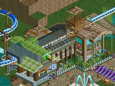
That looks amazing! Can't wait to see the finished product. Also, perhaps a fence or barrier around that tree/bush with the flowers would work. -

 Six Frags
Offline
jusmith, you quickly are becoming one of my favorite non-parkmakers! Really classy work there..
Hope to see it soon,
SF -

 Wanted
Offline
Jimemo the second picture is disqusting IMO. The colors are just wrong... But the other two pics are purrrrdy.
 -

 Liampie
Offline
jusmith: Cool.
JiMeMo: Cool, but it looks like some attempt at a realism park. I think your style is just awesome for making sick fantasy structures, and not for realism. I doesn't look really forced, but it's not too natural either. I like this, but I like your H2H work far more! -

 Katapultable
Offline
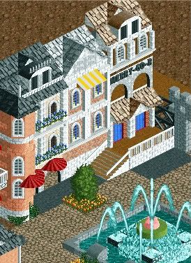
Jusmith:
That's really nice and realistic detail there. My only complaints here would be the plant with the yellow flowers, (I would make a fence around it), and the fountain, in which the pink and green clash. Other than that, good work.
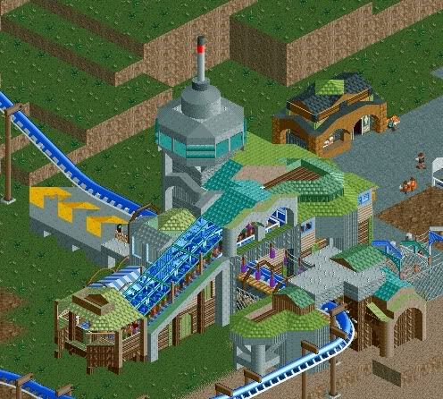
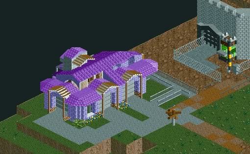
JiMeMo:
The building in the first screen doesn't make any sense to me. It looks a bit thrown together with the flightcontrol room and the wood clashing.
I mistook the building in the second screen for a house, but it are actually garages that look look like houses. The purple looks ugly and the wood on top of the roof doesn't make sense. Also, use one type of roof. There are at least three on that building.
In the third screen there's this clash of different styles again.
 Tags
Tags
- No Tags


