(Archive) Advertising District / Dump-Place
-
 19-April 07
-

 Goliath123
Offline
I think the supports are fine but it will be tough to keep up full custom supports with oul losing insoiration or just by getting bored.
 -

 tyandor
Offline

I fail to see how this is overdetailed. I see very little unneccesary components and it looks like it's supposed to. The only thing that can cause it to go into an overload is by cramming too much in the surrounding area. Overall an awesome screen robbie.
Only thing that I don't like is the color of the flowers.Edited by tyandor, 30 June 2009 - 05:21 AM.
-

TwistedHelix Offline
Looks nice Ripsaw but if I was you I would keep the track banked when it comes out of the overbank as it looks a little awkward going from banked to stright for 2 pieces and then banked in the same direction again.
Cheers
TwistedHelix -

 Dark_Horse
Offline
Dyll, It's a nice start, but there are a few things you could do spruce it up. Add some planters on the patio. Also, try varying the height of that quarter tile piece that sticks out.
 -

 MF72
Offline
I have to agree. I don't think something can ever be overdetailed, only underdetailed. But what do I know?
Dyll, looks like a pretty cool house, which I'm assuming it is. Perhaps a path directly to the water would work too. -

 robbie92
Offline
The lack of activity now is boring me...
Enjoy
Ignore those window glitches for now... -

 egg_head
Offline
I for my part never fucked a moron.
Edit: Wow, that's nice :-)
I really dig the sunken windows. -

 Liampie
Offline
That's perfect, Robbie!
It's not, nothing is. I don't like how the grass grows around the Birch's trunk, and the windows in the right building are like... slanted. Otherwise, it is as perfect as it can be! Really well done, this is my favourite screen from you. Usually I dislike red brickwalls, and I dislike big green roofs, but you pulled it off. It's detailed, yet very tidy. A whole finished park in this quality bust be like one of the best ever. Finish it please!
-

 MCD
Offline
Hi, I´m MCD.
I´m in the RCT community for 3-4 years now. For now I was mostly active on Dutch websites like RCT-Miracles (untill it got closed) and now on RCT-Guide. Since the start of the new H2H5 I have visited NE a lot. Yesterday I decided to sign up.
Maybe you have allready seen some of my work at the "RCT-Guide Group Project"
Here are some other recent screens:
I was trying something new for this one. (Don't mind the glitches) Liampie and Cena allready gave some good tips.
Most of the track is based on this coaster.
-

 Liampie
Offline
Ik wist niet dat de achtbaan dáárop gebaseerd is! Ik zou een mini achtbaan kiezen in plaats van dit tracktype, dat lijkt namelijk meer op de echte en bovendien heb je dan minder knikken.
Sorry for speaking Dutch. I told him how he could improve the coaster!Edited by Liampie, 01 July 2009 - 03:58 AM.
-

 Katapultable
Offline
Robbie, fuck, I love it.
MCD, nice entrance and maybe you're interested in my version of that Vekoma model. -

 Ripsaw
Offline
MCD I think that entrance looks perfect, i really could imagine that in real life and is the the coaster the Enigma Model anyways all looks good..but serously I Love the Entrance.
---------------------------
Heres some more of my up-coming coaster(insert name here) The Fully custom supported GG Coaster..Altho the part shown took just over an hour,i think it came out well besides being in a battle with nausea from looking at the screen so close..Ok here it is =]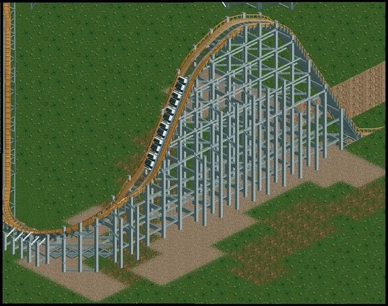
 Tags
Tags
- No Tags

