(Archive) Advertising District / Dump-Place
-
 19-April 07
-

 Katapultable
Offline
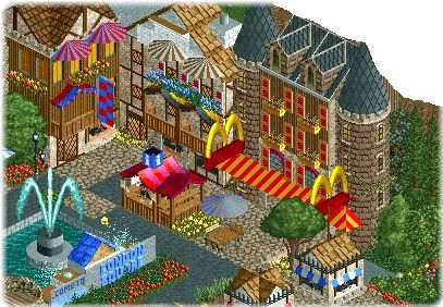
Hey! I finally get what Robbies' avatar is about! [/n00b]
Nice screen. Agreed with all above. The white things are overdone and some grass would be good. -

 Steve
Offline
Rob's entrance is not overdetailed. You look at the entrance/architecture at Main Street in Magic Kingdom and there's victorian decor like that all over the place.
I think it looks phenomenal.
With that said, Rob, you are too good, so I think you should just, you know, stop playing.
-

 Dark_Horse
Offline
Robbie: As other's have said...a bit overdetailed and messy. Some pathing would be nice as well as some grass/landscaping.
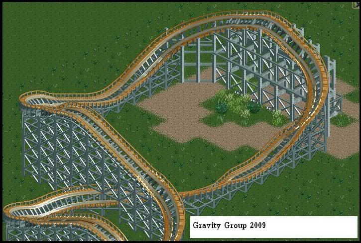
Werner: The layout seems pretty good, but there's a few things that bother me/don't look right. First, I don't see a need for the drop right before the lift. Second, the dip into the brake run doesn't look like right/like it would flow well. I would keep the banked uphill turn, but find a way so it's flat from the turn to the brake run. -

 Louis!
Offline
With that said, Rob, you are too good, so I think you should just, you know, stop playing.

Taking a leaf out of your book then
-

 JDP
Offline
...Hmm, no shit.Robbie: As other's have said...a bit overdetailed and messy. Some pathing would be nice as well as some grass/landscaping.
Werner, as for the layout, it seems to not be tight enough and there shouldn't be a turn that close to the ground. So go back and tighten it up and try and make the first element after the drop more noticeable so it stands out more.
-JDP -

 jusmith
Offline
I've been playing around with some "different" objects. Sorry for the lack of little things that need to be zero clearanced, and also for the lack of windows. Somehow I selected the wrong windows for the bench, I'll have to dimport the others in later.
-

 robbie92
Offline
Way to get unconventional CSO to make a great piece of RCT work!
Seriously, great job... -

 MF72
Offline
Although I hate to say this, I have to agree with Level. There's not much there to see, and I don't think it was worth posting. That said, it looks a little over supported.
 -

 Midnight Aurora
Offline
Dark Horse, do you ever think, "Wow this looks good!", or do you generally think, "This looks very realistic and functional!"?
One of these is correct, and one of these produces your work. -

 Liampie
Offline
Jusmith: On the one hand it looks fun, but on the other hand a lot of (forced?) details aren't making much sense.
 -

 Ripsaw
Offline
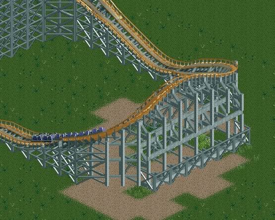
Ive had to put rct2 on my laptop while im waiting to get the money to get my comp fixed, only probs is my laptop dont allow 8cars to work so my hacking is down to a minimum, so i have decided to have a go back at the designs and that being a fully custom supported GGCoaster now ive never been on one or seen one in real life except from pictures. Please tell me your thoughts..does it look messy, how can i improve on the supports =]

"Due to technical difficulties Thorpe Point is not dead but is un-operational, we apologise for the inconvience and hope to have the park back on line A.S.A.P, Thankyou for choosing ThorpeEntertainment."
 Tags
Tags
- No Tags


