(Archive) Advertising District / Dump-Place
-
 19-April 07
-

 TheLegendaryMatthew
Offline
For supports I recommenced using the footers in the B&M Support group, or using the mechanical pipes.
 -

inVersed Offline
The following screens are from Busch Gardens New Zealand, a mini park that I had originally planned on entering in the Road Rally competition at RCTspace but ran out of time. I will instead be submitting it to NE in hopes of winning the bronze.
Ticket Sales and park entrance
Back of the station of Tumatauenga (God of War) -

 In:Cities
Offline
first screen is a bit dull for me, but the second screen really captures that busch gardens atmosphere:]
that looks like it could really be a busch gardens station.
except their queue lines are a bit longer though.
either way, i like it a lot dude:] -

 Nokia
Offline
<33 it.
btw i still thing we should duo it up
Edited by Nokia, 27 June 2009 - 07:30 PM.
-

 TheLegendaryMatthew
Offline

I'll probably make a topic of it if I can finish the "main street" area, and the supports for the Dive coaster.
-Matthew K. -
 LDW
Offline
Wow, I like the coaster layout but think the entrance building could use a bit more color. I don't like all of that black as I'm thinking that a music park should be bright and colorful and has little black if you know what I mean. InVersed, I love the second screen but would add some more color to the first screen and Cocoa, thank screen is epic...
-

 posix
Offline
inversed, i tried to do that kinda stairs down from the station in ll countless times and could never get a version i liked. i like yours in rct2 a lot though.
 -

 Sulakke
Offline
Off course, it's great, but it's a bit messy for my likings. Maybe remove some less important objects.
 -

 Liampie
Offline
There's no need to put those white shit on the roof. Delete some of those objects and it will be great!
 -

 Xophe
Offline
That's amazing! But a wee bit over-detailed as the others have said. I think it'll be alright though if you make the surroundings nice and simple, eg with some open grass or something.
 -

 Werner
Offline
I think that all those details is just what makes it great... otherwise i think that it would just be a number in the row of many.
up next: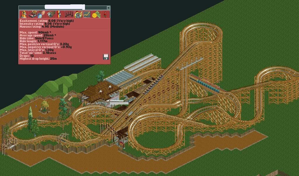
What do you guys think? -

 zodiac
Offline
robbie, are you kidding me? how long are you going to keep teasing me?
werner, i really like that layout, and the theming you have so far looks pretty good from here. keep working.
 Tags
Tags
- No Tags


