(Archive) Advertising District / Dump-Place
-
 19-April 07
-

Colorado-Fan Offline
Yeah, they look very similar, but I don't think that this is a problem, because many Gerstlauer Bobsled Coasters have a Layout like this. -

 Sulakke
Offline
Cena, why don't you just stop playing then?
StormRunnerFan: It looks pretty nice. Maybe some land elevation could do wonders, as the middle of the screens looks a bit plain/boring. I like the buildings! -

 panther33
Offline
I told you guys that I was inspired by Nin's Six Flags. And I am taking it to the next level! I think Im getting better everyday that I play.
It is obvious that this is unfinished. -

FullMetal Offline
^ I'm not a big fan of the colors, especially the red, but the architecture looks nice.
Also, can someone tell me what type of coaster that was that StormRunnerFan posted?Edited by FullMetal, 26 June 2009 - 08:16 PM.
-

 panther33
Offline
Im going to have to guess the Mini Coaster (wildcats) with the wooden coaster trains.
 -

 Nokia
Offline
well he based his park off sfstl.
good luck finshing the park, considering he only got about 3% done so your gonna have to do a lot on your own without copying from pics
-

FullMetal Offline
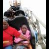
Oh, I think it's supposed to be Tony Hawk's Big Spin. But if that's the case, I totally would've gone with spinning wild mouse cars, instead of wooden coaster cars. Just to get the full effect. -
 jusmith
Offline
There are also some other real life Gerstlauers with similar layouts that do not have spinning cars, mainly in European countries I think.
 -

 TheLegendaryMatthew
Offline
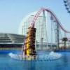
Well, I'd though I show something that I'm working on over summer.
Project: GH
^Unfinished!
Right there is War Pigs, a song on GH2. Yeah, this is going to be a video game/music park
(Yes, I do know there are a lot of music themed parks out there already, but I want to give it a try, for some fun)
-Matthew K. -
 LDW
Offline
I don't really like your station but the layout is good, not exceptional though. You've got those redesigned buttons as well! I've downloaded rctmodified and I still got the original buttons.
-

 TheLegendaryMatthew
Offline
^Well, for the layout, and the station. I may re-design them, I was just messin around with the workbench I made.
 -

 MF72
Offline
Just to tell you Matt, I did a similar project with Rock Band 2, and everyone shot it down.
But I can tell you one thing. It's big. -

 RCFanB&M
Offline
Those path supports look weak. anyway, for some reason i'm loving that screen, maybe just it's just that i'm a color-addicted lol...keep it up man, it's looking great.
 Tags
Tags
- No Tags


