(Archive) Advertising District / Dump-Place
-
 19-April 07
-

 Maverix
Offline
Alright here's the entrance for my new park I've been working on. I haven't zero clearanced anything yet, as my laptop runs vista and everything glitches like crazy, so I'm going to zero clearance once I get this on my desktop.
Everything outside the paths in unfinished as well.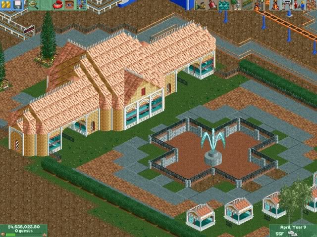
-

 Maverix
Offline
Sulakke-Thanks!
Pudding-Ok and Thanks!
Liampie- There's a gift shop in there too, so I didn't want the guest to feel cramped, as it is small already, and I'm going to add a chimney like Turbin3 suggested.
Wicksteed-Thanks! And I will, I just don't want it to glitch and ruin it, so i have to zero clearance on my desktop.
Turbin3-I assume you mean the non-glass ones? And can do. -

 egg_head
Offline
The supports for the lift semm pretty crappy and you're missing a spare track. As well as color.
 -

 Katapultable
Offline
Work a bit on the landscaping, with those blocks. Esp. in the first screen. It looks really good besides that.
 -

 Nokia
Offline
re-do the lift supports, maybe by looking at some real life pics, if your going for realism, and work on your landscaping a little. overall the coaster looks like a lot of fun.
 -
 LDW
Offline
Here's just something I've been working on lately. I gotta admit that it is some of my best archy yet but all is unfinished:
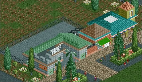
Comments appreciated!
P.S. Do you like the building on the end? I think the raised tower lookes a bit blocky.Edited by LDW, 25 June 2009 - 02:41 PM.
-

 Nokia
Offline
you should like put all these coasters you show in a park
unles its already part of a park... -

 LDW
Offline
I like the supporting but I don't think the colors of the coaster and the station go together. Are all these coasters in a park or on their own?
 -

 StormRunnerFan
Offline
I haven't really been building a park with anything. I get and idea and then think of another topic and move on. So, no. None of the things I show are in the same park.
Louis: Same coaster from where? I have never made one of these before.
 Tags
Tags
- No Tags


