(Archive) Advertising District / Dump-Place
-
 19-April 07
-
 Dark_Horse
Offline
Updated Polynesian monorail station
The first "floor" is where all the mechanical stuff is hidden...any suggestions on how to make the outside look more like that? -
 MF72
Offline
I like it Nokia, just not sure about that teal thing on the roof. Not sure what it's supposed to be, but looks out of place.
 -

 Comet
Offline
I don't like the windows you used on the building on the right too much.
It's pretty cool how you're merging two very different buildings as the station but I think it needs to be a little bit more clean at the point where they meet. It's tough to really say since it's unfinished and the entrance and exit buildings are still there.
For the drop out of the station I think you should make it one of those starts unbanked and banks at the end drop if you know what I mean.
If you're going for Six Flags you did a good job of picking a completely random theme to go along with the name Goliath. I don't think they would be original enough for the coaster to go beneath the station though, and two times at that
Edit: I forgot to say, I really like the screen overall.Edited by Comet, 16 June 2009 - 08:01 PM.
-

 Video_Kid
Offline
I really like that screen Nokia!
My try at my first Pinfari coaster (No Name Yet):
P.S. Yeah, I'm not sure it's good to have so many cars on the track at once, I will fix that. -

 Turtle
Offline
Nokia, the problem with that screen is the boring square pathing. If the pathing was more in line with the building, and had more interesting things along the edges, it would be amazing.
 -

 JDP
Offline
Well Nokia let me tell you this. If you're doing a realistic park and that is obviously a B&M, what you need to do is throw in a 9mph brake. B&M's are made to hit the chain lift at the speed of the chain lift. So if your chain lift is 8mph, put a brake before that lift that is 9mph.
-JDP -

 FK+Coastermind
Offline
Video Kid, IMO, to spinny and boring. suyre, maybe you're doing it to be realistic or something, but to me it seems like alot of solo parks have these kind of coasters in them, but they are so predictable and one note the most of the time viewers just skip over them. if you want it to stand out, do something special to the design to make it fresh and entertaining.
FK -
 Maverix
Offline
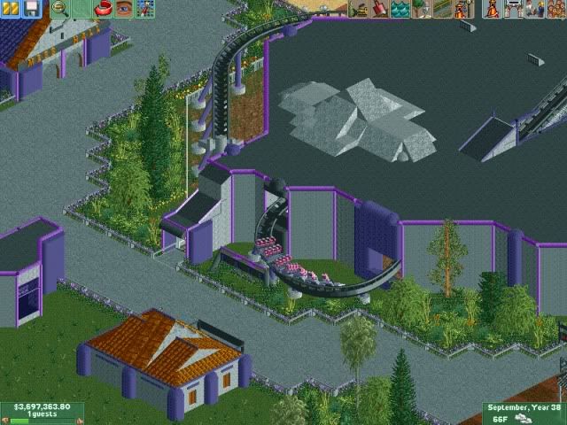
Something I've been working on. It's a fantasy design themed to a futuristic society.
 d
d
-

 Midnight Aurora
Offline
Not to be a dick, but what you've got there is realistic. If it's something that could be real, then it's realistic. If it's not something that could logistically be built, then it's fantasy.
That said, I think it looks like a good start, although a bit bland from both the guests' perspective and our own. -

 Maverix
Offline
MA: I guess I should have been more clear. This is kind of a mix between the two. It could be done in real life, but it most likely wouldn't be, and there's a story behind it that would make it a bit more fantasy too. But thanks anyway.
 -

 Brent
Offline
If the future is purple, count me out.
But yeah, basically what MA said. Don't really get the structure at the top of the station.... has some real pointless pieces for not being viewable in a peep perspective. Supports look nice though, as does the foliage (other than that one palm tree thing sticking out at the bottom right).
 Tags
Tags
- No Tags


