(Archive) Advertising District / Dump-Place
-
 19-April 07
-

 posix
Offline
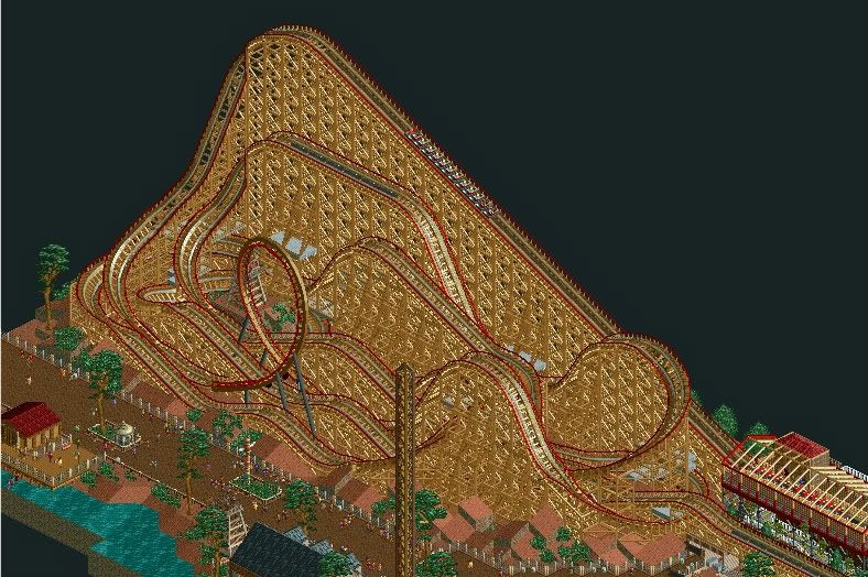
sammy, i like yours. the land texturing is nice and the little grass object is currently very "en vogue" ever since rrp's castle howard. well done.
 -

 StormRunnerFan
Offline
Another pic... another project. What follows has been built today:
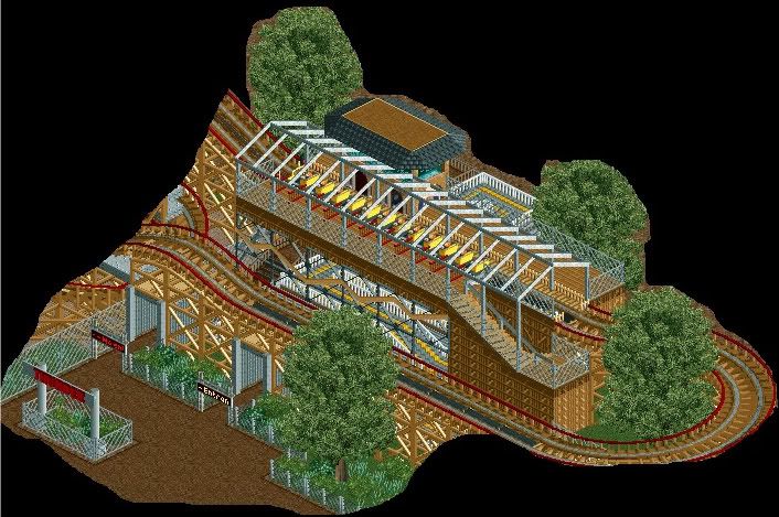
-Storm
Edit: Another image: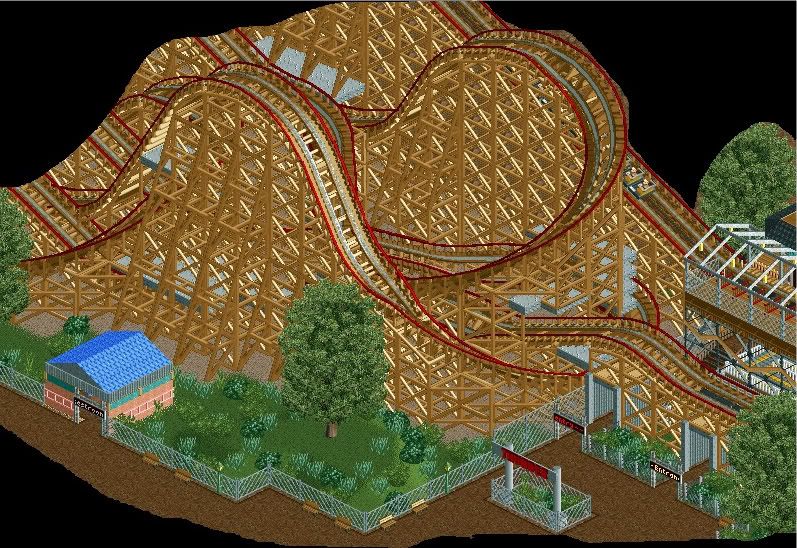
Nokia: The lights work for you? I personally like them a lot!Edited by StormRunnerFan, 14 June 2009 - 05:33 PM.
-

inVersed Offline
I really quite like those screens StormRunnerFan. But those big trees are ugly as fuck imo -

 dr dirt
Offline
Why the blue-green grass?
And it would look nicer with some different kinds of trees in there. -

 BelgianGuy
Offline
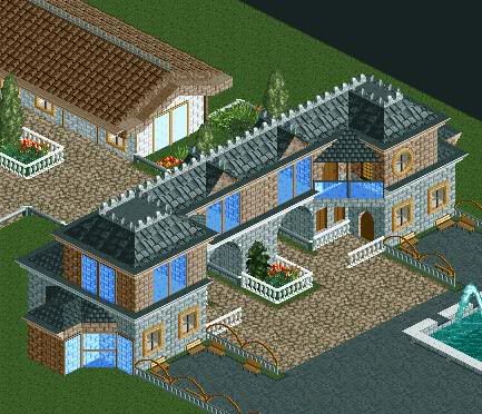
I Finally DLed the Geewhzz bench today and messed around with it a bit, this is the result
-

 turbin3
Offline
Looks pretty good, maybe give the ground under the path another landtype.
And add some details, like a chimney.
 Tags
Tags
- No Tags

