(Archive) Advertising District / Dump-Place
-
 19-April 07
-

 Louis!
Offline
Louis: i dont really get wherer your coming from there at all.
Msn maybe and you can critisise my work as usual.
Sure! Lol! You love it when I critisise your work I do it in a nice way! Haha! I need to have a look at it in game if that's the file you sent me last night. Unless that was porn. I never opened it.
-

 Casimir
Offline
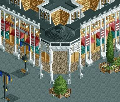
Good lord holy mother...
Is that something that is going to be finished? At THIS level of detail? oO -

 Cena
Offline
@ SSSammy, thanks.
@ Nokia and Dark_Horse, Okay, that is your opinion, I like it so I keep it.
@ Mifune, well, that is the purpose ... Not soon I think but maybe in a year or so.
Btw, same project as the Ratatouille screen I showed a few weeks ago. -

 posix
Offline
I agree with the point that it's very gorgeous but maybe a little overdetailed. Then again you could ask that the reason why we like it so much is because of the many details which help us understand cena's vision.
 -

 Fr3ak
Offline
After looking at it for a while I still don't like the bush AND I don't
like the roof that's on the roof ... if that makes any sense (the brown
roof on the black flat one). -

 gir
Offline
Sammy, it just looks completely random. No consistency. I've seen better from you.
I agree. I think you tried to do too much to this building, and it just doesn't work. It looks like the sort of stuff I used to make (see Elements) except it is architecturally more interesting since it's not 2x2. These days I prefer a much simpler approach, which your open area exhibits nicely. However, your building needs to reflect simplicity as well. -

 SSSammy
Online
okays, how should i simplify it?
how far is still pretty is what i mean.
thanks for the comment -

 chapelz
Offline
cena it is fucking beautiful don't listen to anyone about it being too detailed. the details are what make the screen.
 -

 Liampie
Offline
cena it is fucking beautiful don't listen to anyone about it being too detailed. the details are what make the screen.
Don't listen to chapelz. Only my opinion is true.
-

 Turtle
Offline
Bollocks to being too detailed. Is there such a thing? No. Only a surplus of detail for the sake of it. Which doesn't apply to this screen.
This screen is bloody great. -

 zburns999
Offline
Cena, that's one of the greatest screen shots I've seen in recent memory. Very detailed, but none of the detail is superfluous. As much as I prefer simple buildings, I can't deny that this looks fantastic.
Only concern I have is where you plan to go with this. It almost looks like a street corner in Paris or something. I can't exactly see a coaster within the vicinity--but maybe that's not your intention. Either way, nice work. -

 Dark_Horse
Offline
Just testing out a new style of balcony for the Polynesian:
Foliage not included yet. -

disneylhand Offline
Why are the railings so tall? If a person (in RCT) were to stand on that balcony, the pink railings would be as tall as their heads..
-disneylhand
 Tags
Tags
- No Tags


