(Archive) Advertising District / Dump-Place
-
 19-April 07
-

 Metropole
Offline
Comet: On first glance it looks really nice, but a closer look reveals some problems.
The turn around the vertical drop isn't supported, but I'm sure you know that.
I don't like the raised land with the tree on top where the coaster exits the tunnel. Where would the tree roots go?
The actual dive definately does need some interaction with guests, as has been mentioned. Perhaps widen the hole that it goes down and have a raised bit of path with a good view down it or something.
The main thing I like about the screen are the coaster colours. Usually I'm not a fan of brown steel coasters, particularly b&ms, but this somehow works, and the train colours compliment it perfectly, so good job on that. -

 Lloyd
Offline
Ok man that's weird, i was thinking of making that exact same ride today.
Anyway, looks alright for a first attempt, the supports are a little thin and disproportioned in places, and wouldn't the roto drop cars work better? (assuming it's a frisbee). -

 Milo
Offline
Yeah I agree... it's nice but a little thin and weak... but not bad for a first attempt though.
 -

 Gwazi
Offline
Yeah, I couldn't get the roto-drop cars to look like they were connected to the supports, so I made it like this. However, I just changed it back to the roto-drop cars because I got it to look close enough.
Thanks for the comments.Edited by Gwazi, 05 July 2007 - 02:28 PM.
-

 woofenskid
Offline
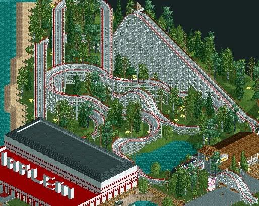
Just playing around, really, practice with transfer tracks with trains on them. I like how the coaster turned out, and you can also see the Harlem movie theater in the screen.Edited by woofenskid, 05 July 2007 - 04:45 PM.
-

 postit
Offline
^Thanks for the suggestions.
The train takes the turns fine, the drop is basically what you can see. The holding brakes are just out of the screen.
I guess I could make a single tile path making a loop around the drop, but that'd be it for interaction with it because of the supports. Also, the station is on top of the cliff you see so it'd be hard to get the queue down there, I'll see if I can though.
Concerning the architecture, would a 2*2 tower at the corner of the tan building be beneficial?I'm not sure what else I could without making it look crowded/messy. Also, both buildings are meant to be a ,connected, large gift shop for the area.
And I'm just not to great with foliage, it's a WIP.
Yeah, just mess around and see what you like best as far as the tower goes.
It's interesting because normally I would also suggest to change the landscape here but I actually really like it the way it is, so well done. I also forgot to mention that maybe you should have some signs for the coaster, the scrambled eggs, and the gift shop. (now I see that it's a gift shop. sorry)
Looking good, Gwazi. I'm sure you have the land gridded that ugly yellow for a reason, so I won't mention it.
Woofenskid: I like the coaster layout but your buildings are very...blockish. If it's a movie theatre, I don't think it will have tiled roofing. I think movie theatres are usually big regtangular blocks, but still, they have little interesting features like ornamental molding and different colored walls and such. Right now your architecture is off. It has the variation, but it's executed poorly. You have those red fences and such...I don't know. Try to rework it so that it looks a big more boring and then add the details? I don't know, try that and then see how it looks. -

 Gwazi
Offline
^ Yeah, that yellow grid is just there for building purposes. It will be gone in the final version. Thanks.
EDIT: One more update. I have found a way to make it so the car can be raised off the ground enough so it won't crash when it operates but won't look odd being too far from the ground, if you know what I mean (Thanks g-ride )
)
Edited by Gwazi, 05 July 2007 - 09:32 PM.
-

 FK+Coastermind
Offline
Lucas29 your pics looks okay from a 'its a park' kinda view but as a fantasy good looking BS sorta view i think it looks great!!
FK -

 eman
Offline
Woofenskid, Im sorry, but thats a VERY weak layout. There is a lot of consecutive flat areas without elvation change, the track is very scattered and strewn about (lacks parralel straights, realistic crossovers, etc.), and the layout only has 4 instances of airtime and a lot of plain flat turns. Id suggest looking at a certain companies woodies and using some of the techniques they use to make your woodie layouts more realistic and exciting. (My suggestion would be to look at some vintage cci stuff, they are commonly considered the best o the best and when done right can be made to look amazing in rct)
 -

 Carl
Offline
Gwazi, I think you just have to use thicker poles and raise that counterweight on the top and youll have it
-

 CedarPoint6
Offline
These are from like 6 months ago when I was messing around with trying to get a compact coaster with trains running smoothly in block sections. All these run the trains well with no stacking, so I'm glad they came out. I don't really intend to take these any further, though, unless I do a fairground park, which is a possibility one of these days.
Non Looping: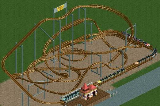
Single Looping: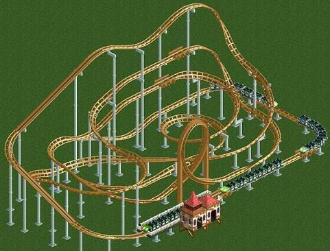
Double Looping: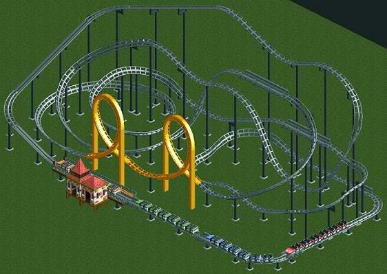
-

 CedarPoint6
Offline
Wow, I REALLY like that. The tower in the center is really nice looking with the lamps and stuff. Very classy.
The pink section of the building seems a little odd, although I do like the color variety.
I'm definitely interested to see more!
 Tags
Tags
- No Tags

