(Archive) Advertising District / Dump-Place
-
 19-April 07
-
 Gwazi
Offline
@OLE - You know what I think.
@inVersed - That screen is so inspiring.
@pBOB - I think it looks like an actual building as it is. -

 deanosrs
Offline
pBob - I'd make the 2x2 on top into the same building as the other bigger building on top, will look better then imo, it looks wrong to have a 2x2 there and the different roof kind of screws it up a bit as well for me.
 -

 zodiac
Offline
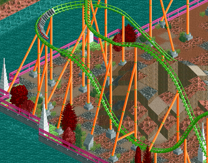
Camcorder22- What you have is great, but that big cobra roll is hideous. Put a track piece or two between the corkscrew pieces to make it look more natural.
pBOB- You're very good. I love it. Looks fine as it is. -

 rheathy
Offline
http://img521.images...age=scr1sb7.png just a quick picture from something ive been working on, it's my first park though , so dont be too harsh!
 -

 Liampie
Offline
http://img521.images...age=scr1sb7.png just a quick picture from something ive been working on, it's my first park though , so dont be too harsh!
I don't like the brickwalls and the path in the middle.
Beside that, it's nice. -

 Lloyd
Offline
The support work leaves alot to be desired, but it actually looks pretty nice. Maybe smoothen the landscaping out. Keep going, not bad at all.
 -

 rheathy
Offline
http://img512.images...age=scr2tk4.png
http://img159.images...age=scr3oi4.png
A couple more pics from the park, I realise the buildings need a lot of work on them, so i will try and sort that out aswell -

 JJ
Offline
Direct link to the image please rather than making me wait longer so the shit around the edge will load. I hate it when people do that!
 -

 penguinBOB
Offline
The pink and the orange are a bit much and the trees are just ugly. Coaster looks fun.
 -

 postit
Offline
I'm just worried that the train is going a bit fast on those turns since I can't see the top of the vertical drop. I think it would also be a good idea if you made the vertical drop itself have more interaction with the path. If not, build the queue so that it comes very close. I think that that would be great if I was a guest in your park.
I think that maybe a third story to one of those buildings may vary the architecture a bit. Make sure that it all serves a purpose though. I can see part of one building as a queue area, but the rest of that building and the other building looks like "theming" and frankly, I don't think that this is good.
Some of the foliage could also use some work. Try to make it look...i don't know. Just like many will suggest to look at real buildings for help on architecture, I would suggest looking at real greenery for foliage.
I know it's unfinished and I'm sorry if at any point I've been too hard on you. Keep on trucking. -

 Comet
Offline
^Thanks for the suggestions.
The train takes the turns fine, the drop is basically what you can see. The holding brakes are just out of the screen.
I guess I could make a single tile path making a loop around the drop, but that'd be it for interaction with it because of the supports. Also, the station is on top of the cliff you see so it'd be hard to get the queue down there, I'll see if I can though.
Concerning the architecture, would a 2*2 tower at the corner of the tan building be beneficial?I'm not sure what else I could without making it look crowded/messy. Also, both buildings are meant to be a ,connected, large gift shop for the area.
And I'm just not to great with foliage, it's a WIP.
 Tags
Tags
- No Tags
