(Archive) Advertising District / Dump-Place
-
 19-April 07
-

 Louis!
Offline
Well thats the idea TBH
When a coaster is build they force all these kind of things
Yes they do, but they intergrate it in with the surroundings. Here the arch is on it's own. You wanted it to go through an arch so you made an arch for it to go through.
It looks too unnatural. -

 Liampie
Offline
The arch looks like Cena's landscaping.
Just slightly better... Still forced, though. -

 Cena
Offline
The arch looks like Cena's landscaping.
And that is still well better then that you will ever build
Wait and see, you little bastard
-

 Liampie
Offline
And that is still well better then that you will ever build

Wait and see, you little bastard
You are WAY too arrogant! -

 Turtle
Offline
He had provocation to be fair.
In a little aside, i'm a bit sick of all these Dutch bitch fests. -

 Nokia
Offline
@liampie, like you have any room to talk.
@turtle, agreed
@the screen, maybe work with the arch a little, it looks a bit forced. but other than that the screen looks great! -

 Midnight Aurora
Offline
I lost my internet for about a week there, so I started building again. L.L.L.L.
Blacked out because I don't want to show it, not because it's not finished. Plus, I just wanted to show off my awesome MSpaint skills. (You know you're jealous.) -

 Ozone
Offline
I must know what is blacked out there! The supports look nice, the foliage too. Possibly a bit sparse, but looks like some thought went into it. Show us more.
 -
![][ntamin22%s's Photo](https://www.nedesigns.com/uploads/profile/photo-thumb-221.png?_r=1520300638)
 ][ntamin22
Offline
I lost my internet for about a week there, so I started building again. L.L.L.L.

Blacked out because I don't want to show it, not because it's not finished. Plus, I just wanted to show off my awesome MSpaint skills. (You know you're jealous.)
All hail the glorious leader and eternal president.
is this sliced bread, or the castle, or other? -

 Brent
Offline
Sweet screen... I was just looking at Evergreen Canyons last night. Loved your B&M Invert in there...
 -

 posix
Offline
Wow, MA is playing? That's awesome. I love the screen. I think it's quaint. Took me a good while before i noticed the custom supports. Good idea of using these objects like that although I have to say people treat the barrels as a "good for everything" kind of object, which most of the time doesn't seem to work too convincingly in my eyes. Here it's quite nice though.
 -

 ivo
Offline
I like that DL! A lot better then then most of you other work.
I would put a white background behind that clock and don't put two windows like that next to eachother. That is the only thing I can come up with.
Good job!Edited by ivo, 13 May 2009 - 06:55 AM.
-

 Pudding
Offline
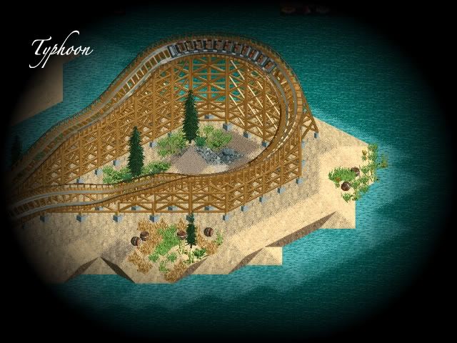
@ Maverix: Looks nice, the only thing i don't like are the different sandtypes under water.
@ DelLagos: Great, I agree with Ivo on the windows, and i would put something in the sides of the clocktower, nog it looks kinda bare. -

 Louis!
Offline
I lost my internet for about a week there, so I started building again. L.L.L.L.

Blacked out because I don't want to show it, not because it's not finished. Plus, I just wanted to show off my awesome MSpaint skills. (You know you're jealous.)
AWESOMES.
 Tags
Tags
- No Tags


