(Archive) Advertising District / Dump-Place
-
 19-April 07
-

 Nokia
Offline
yes nin.
what could i do to execute it better you guys?
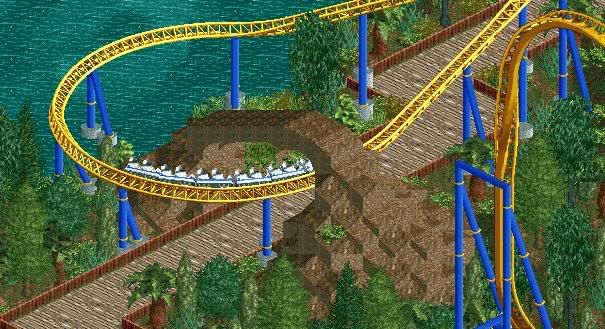
well right now theres too much brown, so change the track color.
get rid of the angle supports.
just check out the way comet did it in project:classix
he did it pretty good i think
@snas: looks great! but the supports look to flimsy right now. -

 Cena
Offline
Nokia and Turbin3, the supports are correct for this type of coaster
He is building an Indiana Jones ride
Snas it is looking very good, but goddamned, finish this project


-

 Goliath123
Offline
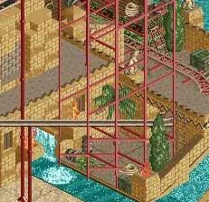
Mozilla, thats really good, i like the water ride, but as Brian said use some more supports, maybe a waterfall too?
 -

 Brent
Offline
Still highly unsupported... they way you have it cannot hold up that much weight. Namely at the top of the turnaround.
 -

 BelgianGuy
Offline
If you still want to keep that look I'd say use something with more body so it looks like it can actually hold it up.
Anyway I got just another random screen for you guys, hope you like it
-

 Brent
Offline
Only thing I say the screen could use is an additional horizontal support beam on the vertical track.
 -

 BelgianGuy
Offline
Well thats the idea TBH
When a coaster is build they force all these kind of things -

 Cena
Offline
Louis! isn't talking about the coaster, but about the arch, and I have to agree with him, it looks to forced and it looks ugly, try to make it more natural (if possible
 )
)
@ Mozilla, talk to me on msn and I will help you with your water ride (have an idea for it how you can make it more realistic
  )
)
 Tags
Tags
- No Tags


