(Archive) Advertising District / Dump-Place
-
 19-April 07
-

 Dark_Horse
Offline
*slaps Goliath across face*
At least, I give people constructive criticism.
Dark_Horse -
![][ntamin22%s's Photo](https://www.nedesigns.com/uploads/profile/photo-thumb-221.png?_r=1520300638)
 ][ntamin22
Offline
I'm a fan. The bushes on that trellis are a little awkward I guess, but they'll do. I'd prefer a more natural dirt color under the supports as well. other than that... lovely.
 -

 Goliath123
Offline
*slaps Goliath across face*
At least, I give people constructive criticism.
Dark_Horse
My face has not been slapped and i dint need to comment on anything its perfect better than a warehouse -

 K0NG
Offline
Yeah, the shrubs above the queue are not working. Remember that any kind of foliage needs soil to grow from. Unless it's hydroponically grown...in which case you'd have to establish that somewhere along the line. Also, not real sure about the purple and gold blocks coming off of the wooden planks there (although I love the color combo...go LAKERS!!!!) on the station....nor, the black/white crown moulding coming off of that. Don't just add shit to add shit. Make sure it fits and makes sense when you get to detailing things. And, either fix or remove the triangular blocks under the track (because ,I assume that they're not supposed to 'float' there. And the blue flowers....have you ever seen flowers that color?
Other than that.....it's rather decent. -

 Dark_Horse
Offline
Goliath, maybe it's better than a warehouse, but that's what the part of the project I'm advertising it. I gave him some things to fix, did you? No. There's nothing that really catches my eye, since that's what his screen is supposed to do. Panther, you need to xero-clearance over the entrance to complete the station. And as for the blocky comment, warehouses ARE boxes in real like, where as most coaster stations are not. Learn your facts, man.
 -

 JDP
Offline
Oh god. Both shots are just stunning. The colors on the intamin are out of the ordinary and work great, imo.
-JDP -

 robbie92
Offline
^That's the only part I don't like in them. The coaster colors don't work for me at all, but therest is great.
 -

 geewhzz
Offline
i think the intamin track/supports would all look much better in a solid color. i can't recall any intamin track every being multi-colored rails, like B&M does.
 -

TwistedHelix Offline
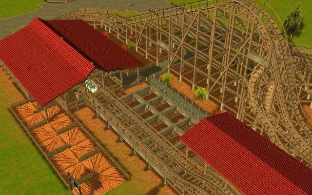
Just some more RCT3 work. This time a custom supported family woody. This is my first time using custom supports for a wooden coaster in RCT3 and they are based very closely as far as I can tell on a actual company. I'm not gonna say what company as I wan't to see if anyone can guess but the station and transfer building is heavily based off of the station and transfer building of another wooden coaster produced by this company. Also not the screens are unfinished.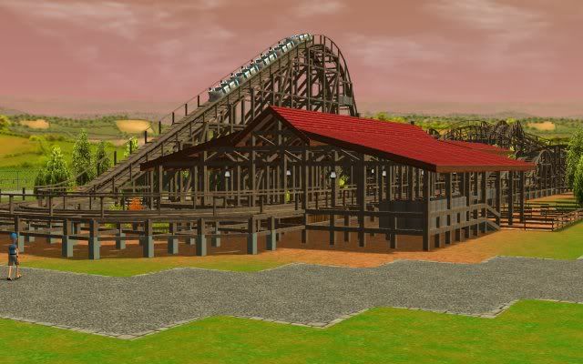
Cheers
TwistedHelixEdited by TwistedHelix, 23 April 2009 - 06:05 PM.
-

 JDP
Offline
^No.
Um I don't know of any family wooden roller coasters that have 5 3 row cars. May want to fix that if you are going for realism.
-JDPEdited by JDP, 23 April 2009 - 06:45 PM.
-

TwistedHelix Offline
Nokia: Thanks and dont worry the queue isn't finished yet
panther33: Thanks and nope not Dinn Corp
JDP: Actually the companies junior model runs 5 car 6 seater trains so I thought I'd be okay running a family one witht he same trains.
EDIT: On looking at rcdb it would appear that you are correct JDP. My mistake. I'll change the cars to 2x2 instead of 3x2.
Cheers
TwistedHelixEdited by TwistedHelix, 24 April 2009 - 02:44 AM.
-
 Timothy Cross
Offline
I'm gonna post a pic for the first time in YEARS!

something i built ages ago, obviously very incomplete. it was meant to be an earth-based spaceport built on a crazy landscape with a road going through the middle where the launching pads are located (it's supposed to be themed to the future, so today's rules don't apply) to the parking lot on the south end. guests would have gone to attractions about 'space' of course. And no, this wasn't "FantastiCo's Intergalactic Resort". just thought i would post this to show where my style's been heading over the years. this only previews my recent work so i decided to post it, when actually, i think this is shit.
 Tags
Tags
- No Tags


