(Archive) Advertising District / Dump-Place
-
 19-April 07
-

 Jazz
Offline
Funny thing is, people still think it's amazing. You probably would've won.

Um ... no.
PBob's park looks really good from the screens with some nice potential ... but Phatage's park would've still won, in my opinion. -

 CrazyCoaster
Offline
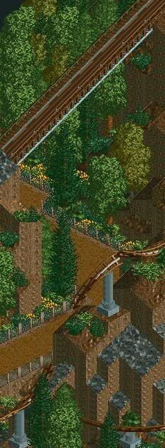
A woodcoaster ( Robin Hood to the rescue! ) from my unfinished park : Busch Gardens Medieval Resort
http://img505.images...age=scr7sa7.png
http://img209.images...age=scr8we1.png -

 Lloyd
Offline
I actually think that has a really nice atmosphere
 Sure it could use work, foliage etc.. but the atmosphere in the first screen is great.
-

 Emergo
Offline

^ Still remember that screen PBob as if the first time you showed it was yesterday (while it must have been > 18 months ago?!...)
It still impresses me as much as the first time I saw it. It's awesome, beautiful and very unique.
Rest of the screens aslo look very good.
What a pity you won't be able to finish this one.
Is that because you have no time, or....?
Emergo -

 CedarPoint6
Offline
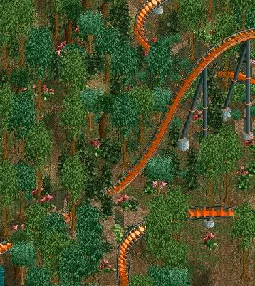
In the interim between finishing my park and the start of the PT, I'm having a look back and trying to finish some old designs. Here's one from February of 06. I think I showed a screen of this in one of the Fiestas.
-
![][ntamin22%s's Photo](https://www.nedesigns.com/uploads/profile/photo-thumb-221.png?_r=1520300638)
 ][ntamin22
Offline
pineapple- the only thing i can think of upon seeing "Kronikal" is krunk.
this is not good. -

 Milo
Offline
pretty nice CP... although all the missing track is kinda odd... if it's track jumps they don't really work imo...
 -

 Fr3ak
Offline
Just some tryings with a freefall in cactus design.
Edited by Fr3ak, 01 July 2007 - 04:14 AM.
-

 penguinBOB
Offline
Mostly lack of motivation. Building takes so long and it gets boring after a while. No time as well.
^ Still remember that screen PBob as if the first time you showed it was yesterday (while it must have been > 18 months ago?!...)
It still impresses me as much as the first time I saw it. It's awesome, beautiful and very unique.
Rest of the screens aslo look very good.
What a pity you won't be able to finish this one.
Is that because you have no time, or....?
Emergo -

 zodiac
Offline
Fr3ak: looks interesting. Looking forward to how that looks in a full park.
Little something in my sig. -
![][ntamin22%s's Photo](https://www.nedesigns.com/uploads/profile/photo-thumb-221.png?_r=1520300638)
 ][ntamin22
Offline
-.- no comment.
fr3ak, it looks like a christmas tree. don't most cacti have alternating branches? -

 Liampie
Offline

I like the idea of a cactus, but now the branches are floating.
You should make some supports! -

 Milo
Offline
This is what I was cooking up for first the Best Bridge round and then the Bonus Round. Obviously I didn't finish it mostly due to losing interest in it after computer problems prevented me from getting it in to the bridge round.
There was still a lot to be done on it but you get the general idea.
A monorail was supposed to go under the buildings in the center (where the two holes at the bottom are with the gray tile path).
Overview.
Oh I will be participating in the Wildcard round though. Just finished the layout this afternoon in fact. -

inVersed Offline
I have been messing around with the Create Your Own Six Flags scenario, park making without custom scenery for my first time, despite actually playing the other scenarios). Really it gives the game a completely different flavor. I just can't wait to watch the peeps go through the park. Heres a screen-
Obviously this screen is incomplete in many areas. What it shows is the parks first coaster - Corkscrew and the park's carousel.Edited by inVersed, 03 July 2007 - 07:37 PM.
-

 penguinBOB
Offline

How do you make this building look less gimmicky and more like an actual building?
 Tags
Tags
- No Tags


