(Archive) Advertising District / Dump-Place
-
 19-April 07
-

Wicksteed Offline
this has too much 1/4 tile- textures repeating over and over, which makes it look strange and not flowing. -

 Louis!
Offline
I think it's actually pretty good.
I wasnt saying it was really bad, I was just telling him that it was better when he showed me a more unfinished version of this screen. -

 nin
Offline
unfinnished.
feedback apreiciated
finish the screen first. There's almost nothing to comment on.
At the moment its just a little hill with stairs leading up to a random picnic area, random white deco pieces, and small buildings that have no purpose what so ever. -

 SSSammy
Offline
well its useful to know wether or not ive wasted my time placing a little hill with stairs leading up to a random picnic area, random white deco pieces, and small buildingsthat have no perpose whatsoever, and wether or not i should carry on
Edited by SSSammy, 14 April 2009 - 02:43 PM.
-

 robbie92
Offline
It's okay, but when can we ever see a finished screen of something? Nothing you have is ever completed...
Please, next time, try to finish something before you post a screen, or do what I do and crop your screen so it looks finshed
-

 Louis!
Offline
I think sometimes people forget this is just a dump place. Unfinished screens are meant to belong here, and by posting an unfinished screen it helps to give ideas on how to improve whats there before going on to finish it.
People dont have to bitch about it. -

 robbie92
Offline
^I know. I was just wondering if SSSammy would post something finished soon. I like his work, and I really want to see something more than a layout or something barely themed.
BTW, how's that gokart park going? I wanna see more screens. -

 SSSammy
Offline
aha thanks robbie that means alot from one of my favourite parkmakers c:
CheeVa, its kinda a craggy kinda rock youd find on a coastline, giving a good vantage point. (hence the pay+usetelemascope)
thanks for all the feedback guys.
ill post anotherscreen once ive done abit more of it.
i think what annoyed Louis was the colours of the shop, which are now changed.
thanks. -

 Louis!
Offline
The shop colours? They were fine.
I explained it was the annoying art deco pieces on the landscape, it should be landscaped more, it's almost as if you used that as an excuse to not landscape.
However after viewing that park of yours today, this is miles better well done bud!
-

 egg_head
Offline
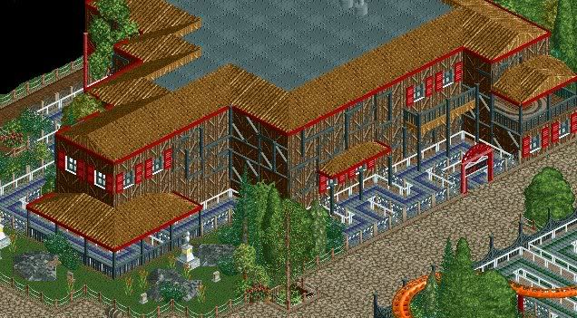
Would be Even cooler with a portion of the ride coming out of the house and going into it again (over the queue and visible from the path) with a sign and the Ride's name on it.
 -

 T.N.T.
Offline
Pretty walls. All I'd say is add bushes or some vines to make it more "worn-down", if that is your intention.
 -

 K0NG
Offline
Would be Even cooler with a portion of the ride coming out of the house and going into it again (over the queue and visible from the path) with a sign and the Ride's name on it.
My thought exactly. Looks really good so far though Nok.
 Tags
Tags
- No Tags


